Take a look at a selection of our recent projects, crafted with care and designed to make an impact.
BRANDING - LOGOS - EDITORIAL - DIGITAL & PRINTED MEDIA - PROMOTIONAL ITEMS - GRAPHICS -
BRANDING - LOGOS - EDITORIAL - DIGITAL & PRINTED MEDIA - PROMOTIONAL ITEMS - GRAPHICS -
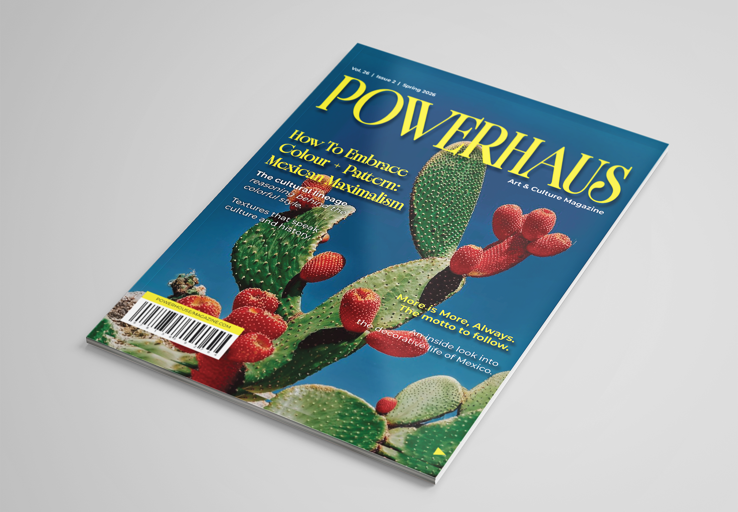
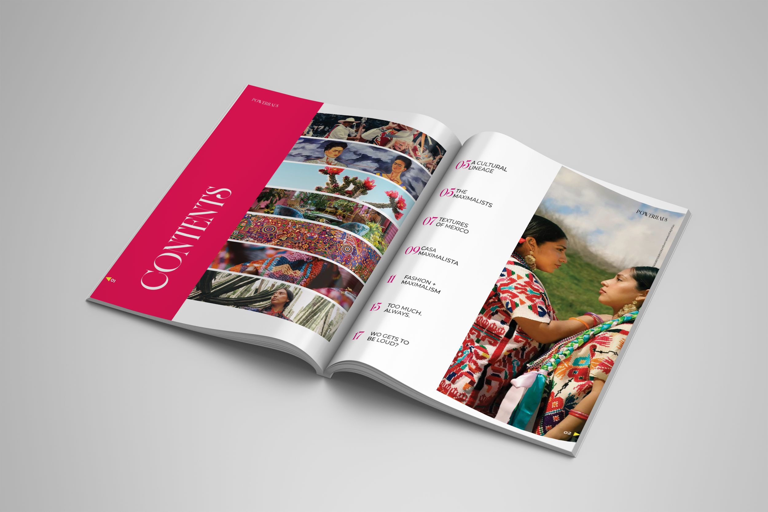
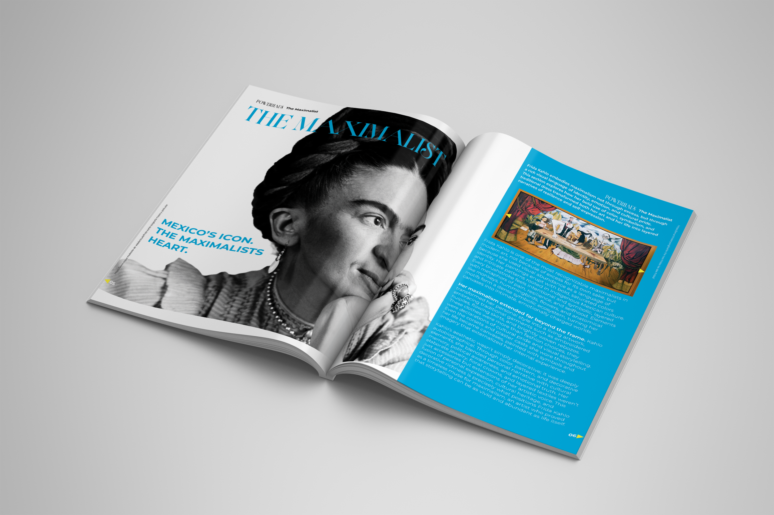
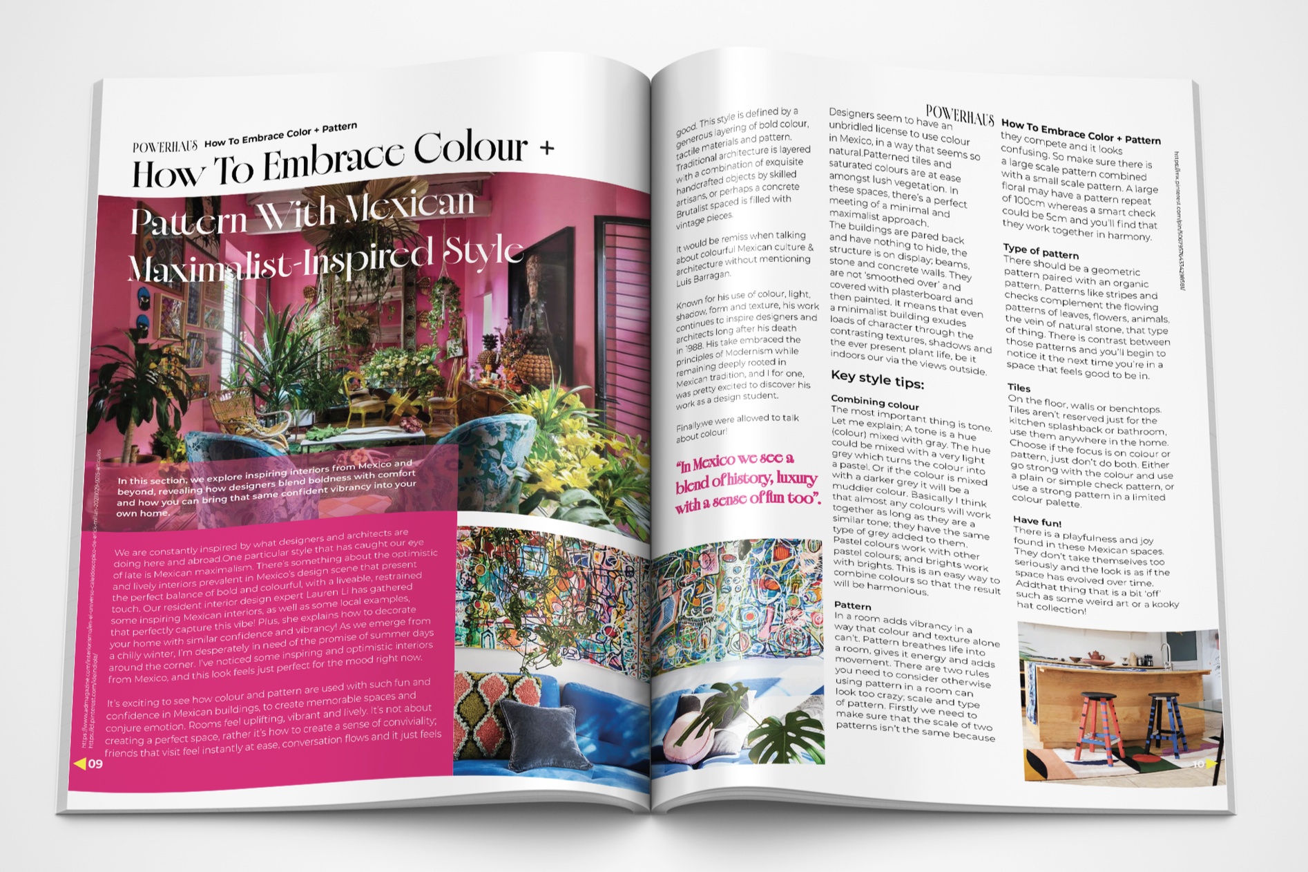
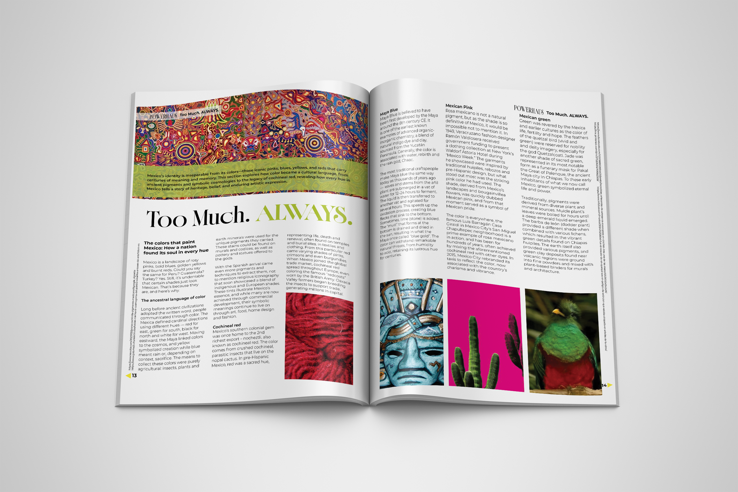
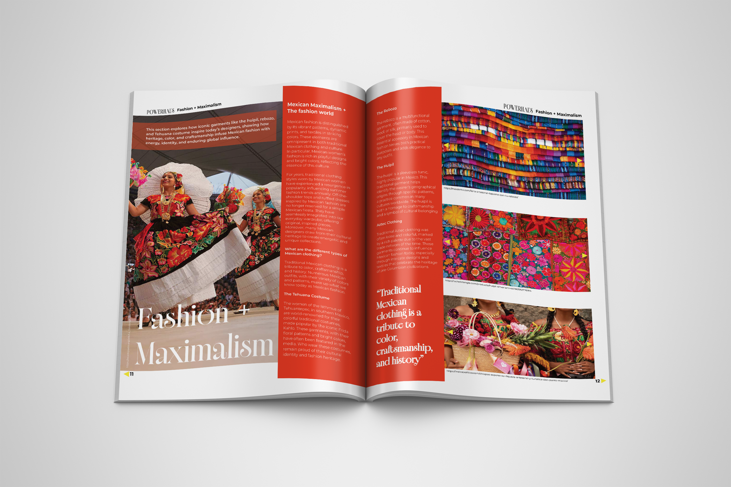
POWERHAUS - Interactive Magazine This project, POWERHAUS, is an interactive magazine centered on the concept of Mexican Maximalism, celebrating bold color, layered pattern, expressive typography, and cultural richness.The goal was to design a fully realized, professional publication that captures the vibrancy and visual abundance of the movement while maintaining strong editorial structure. Through intentional grid systems, dynamic layouts, typography hierarchy, image treatment, and interactive elements, the magazine balances maximalist energy with clarity and cohesion. POWERHAUS explores how thoughtful design decisions can elevate cultural storytelling into an immersive, contemporary editorial experience.
POWERHAUS - Interactive Magazine
POWERHAUS - Interactive Magazine
POWERHAUS - Interactive Magazine
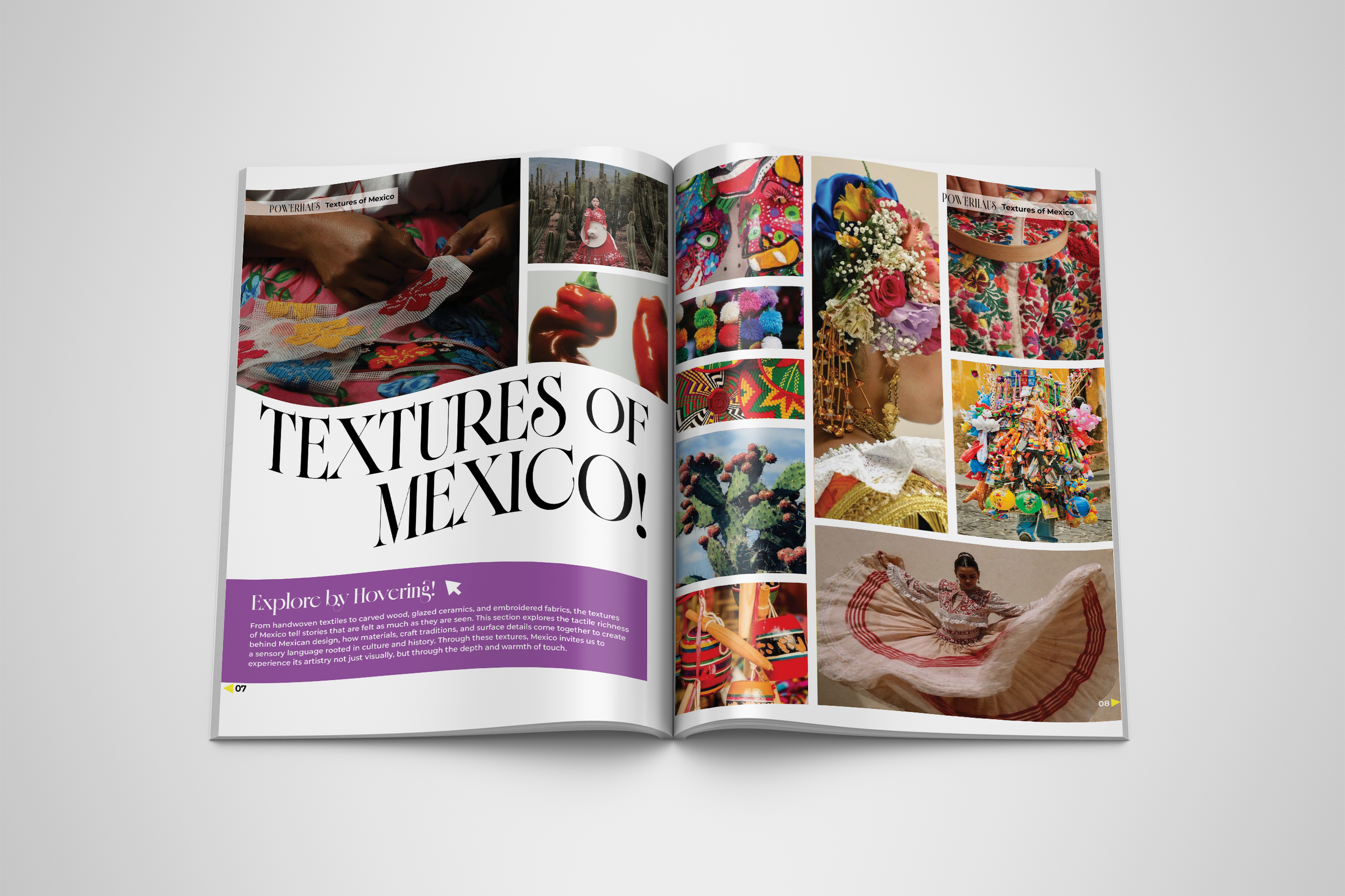
POWERHAUS - Interactive Magazine
POWERHAUS - Interactive Magazine
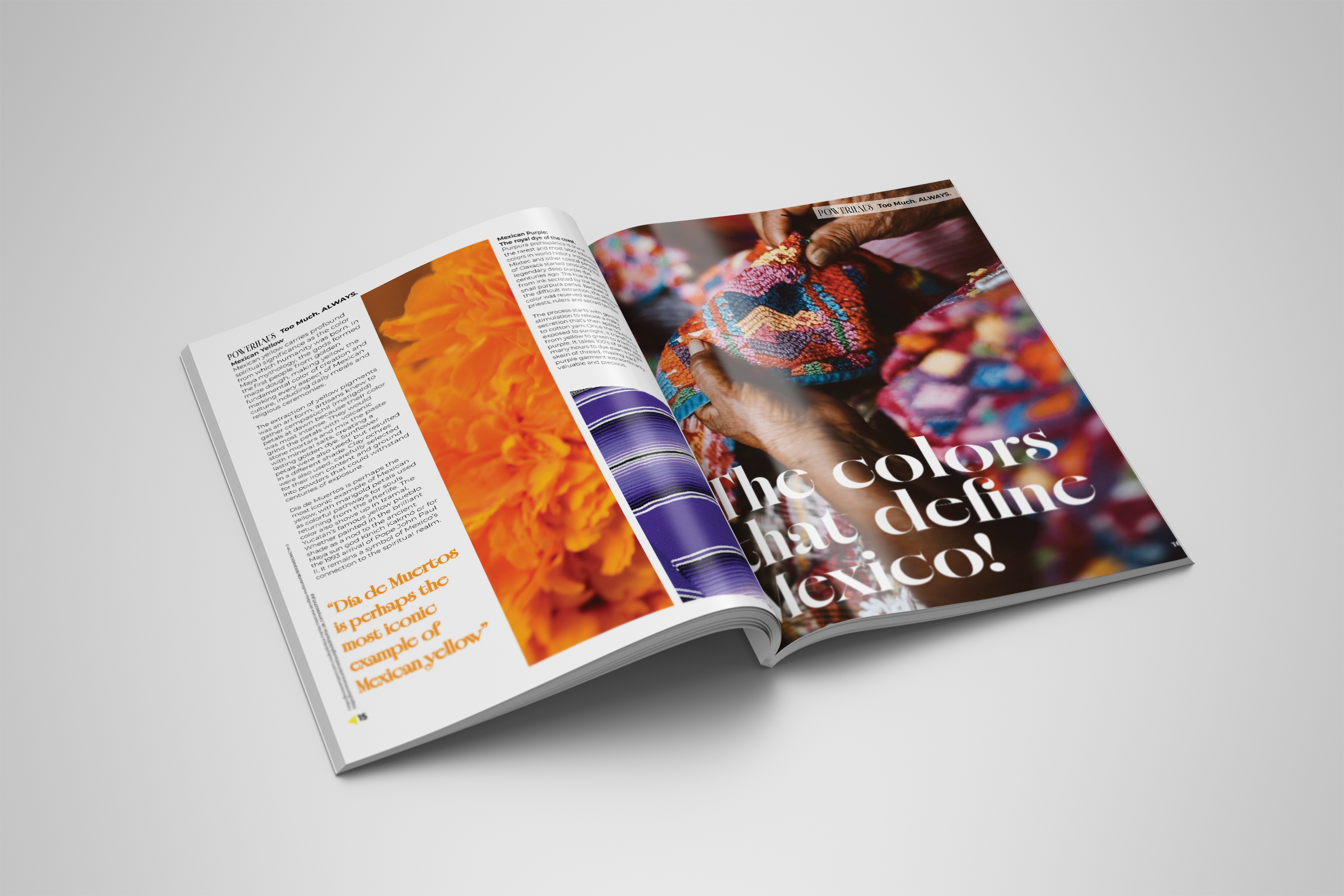
POWERHAUS - Interactive Magazine
POWERHAUS - Interactive Magazine
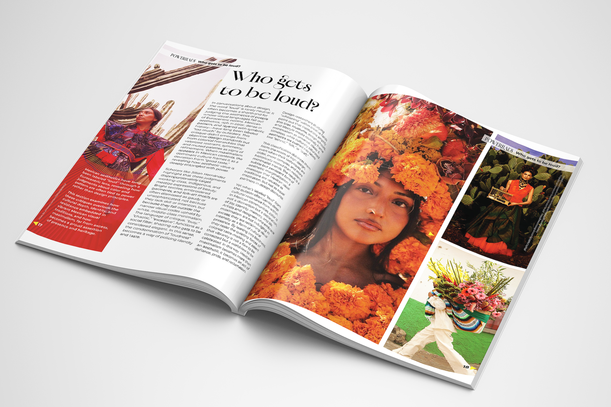
POWERHAUS - Interactive Magazine
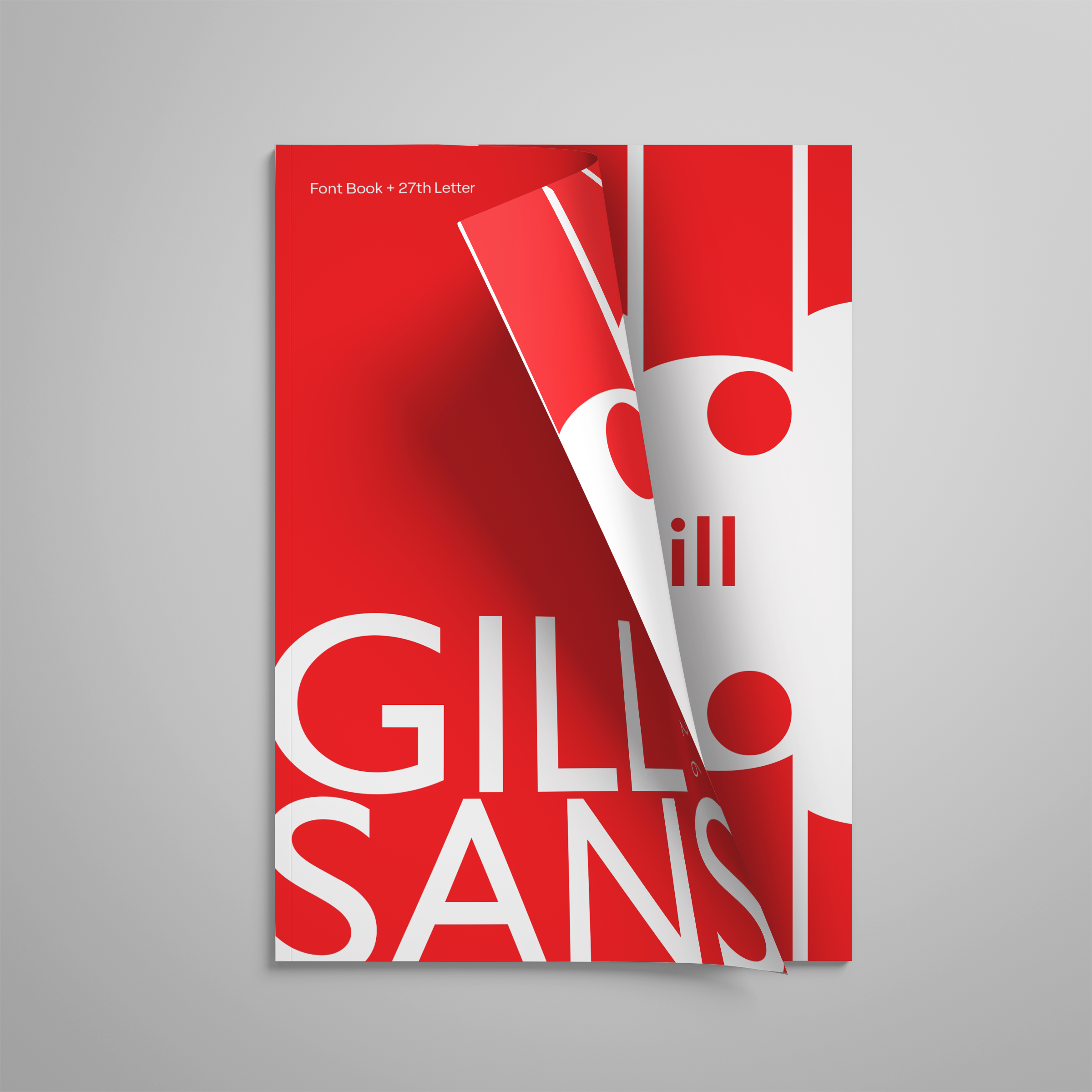
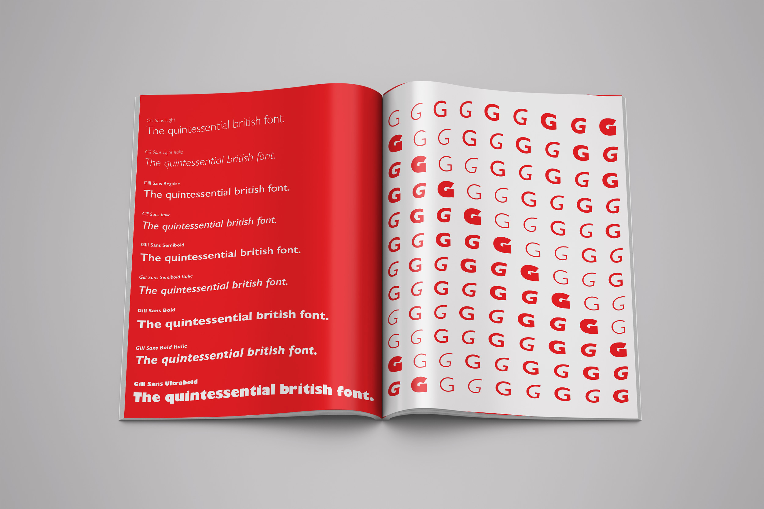
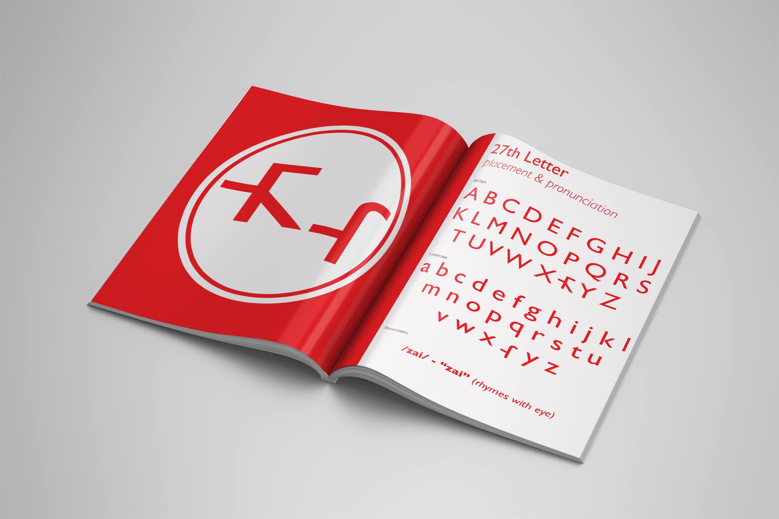
Gill Sans - Font Book This project is a typographic magazine dedicated to Gill Sans, exploring its history, formal characteristics, and cultural impact. The book analyzes the typeface’s structure, its humanist proportions, counters, stroke contrast, and sans-serif construction, alongside examples of its use across different contexts. The highlight of the project is the creation of a conceptual 27th letter designed to seamlessly integrate into the Gill Sans family. Through close study of its weights, curves, terminals, and overall rhythm, the new character was developed to feel authentic, balanced, and true to the typographic voice of the original typeface.
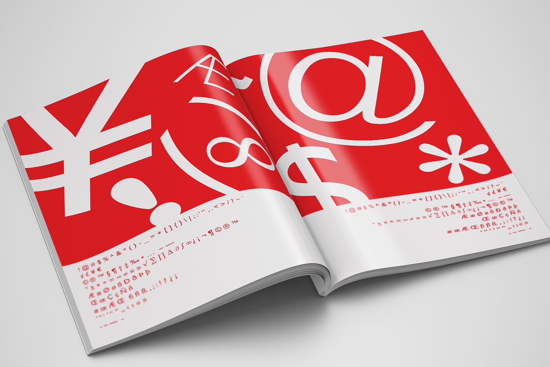
Gill Sans - Font Book
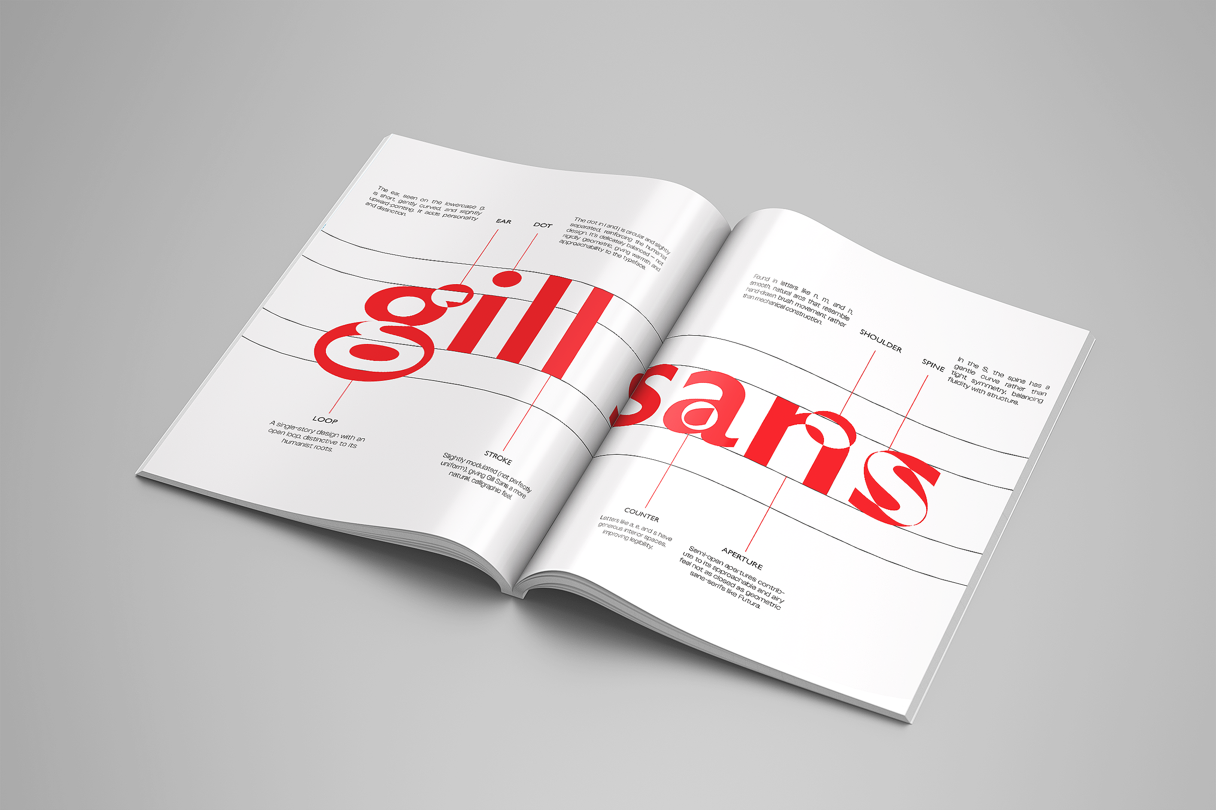
Gill Sans - Font Book
Gill Sans - Font Book
Gill Sans - Font Book
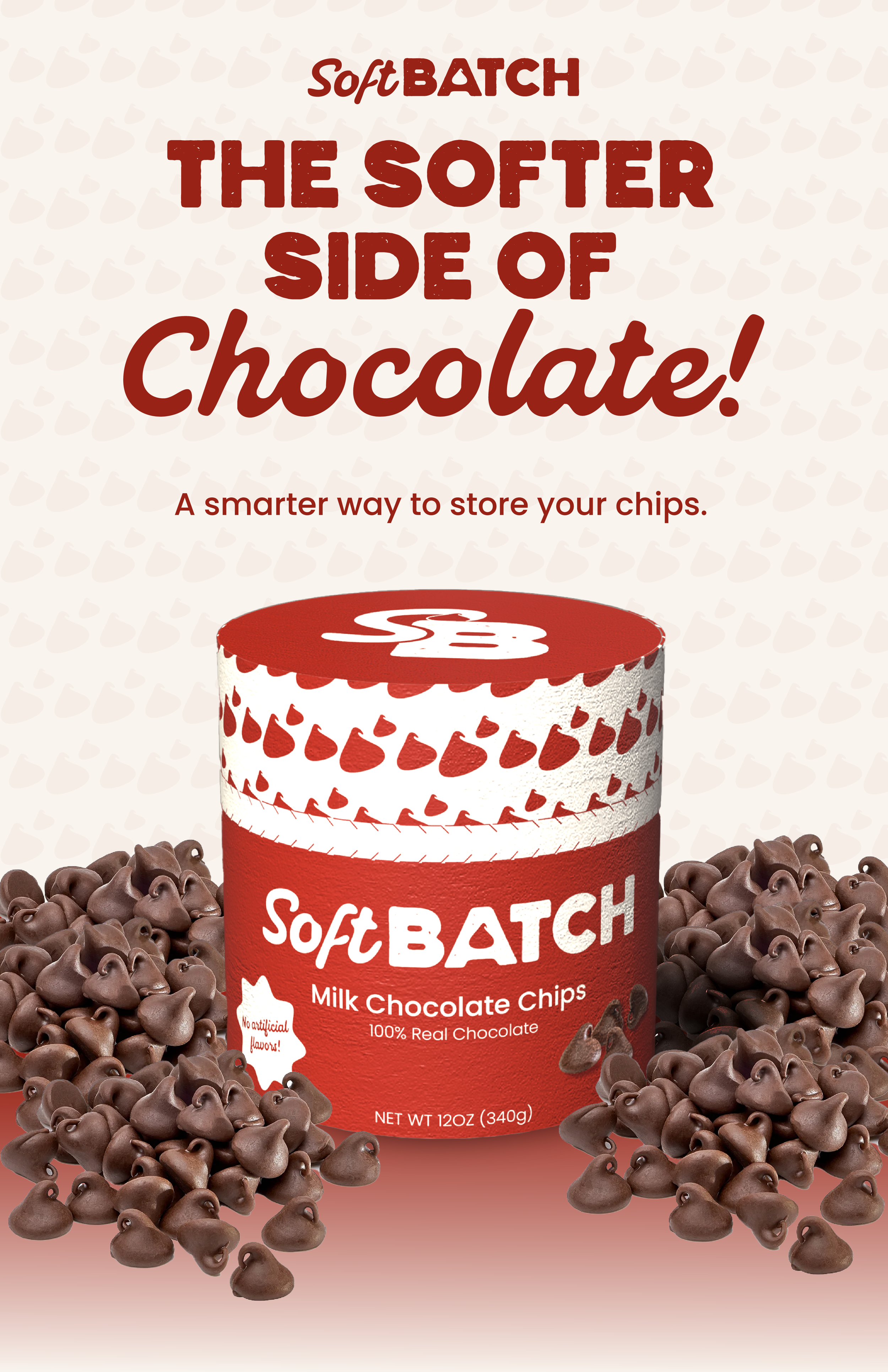
SoftBatch - Packaging Redesign
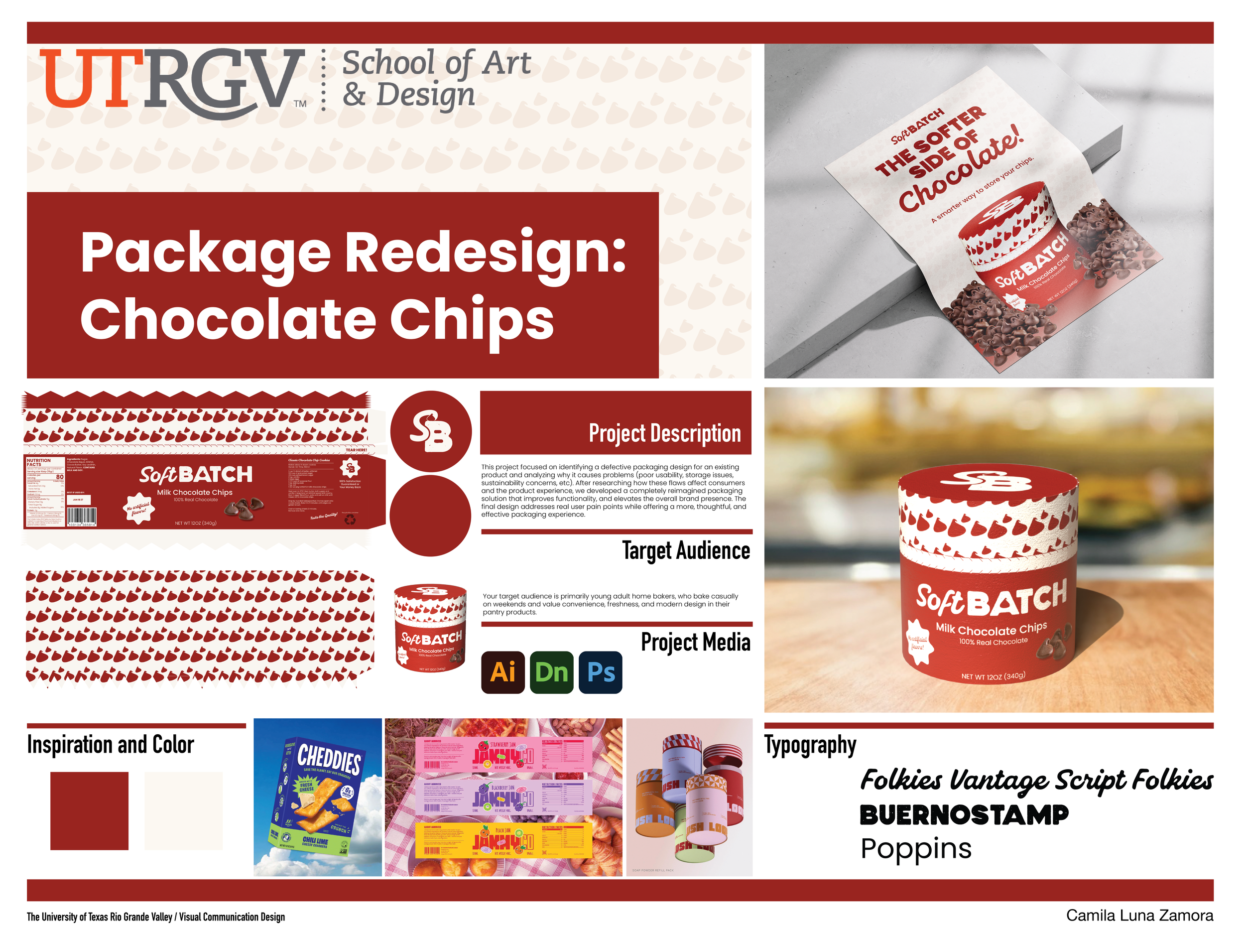
SoftBatch - Packaging Redesign SoftBatch is a packaging design project focused on investigating a “failed” or defective package from an existing product. The project analyzes how graphic design influences not only the visual appeal of packaging but also its usability and functionality. Through research and redesign, the goal was to identify design flaws and propose improvements that create a package that is both aesthetically engaging and more effective for the user.
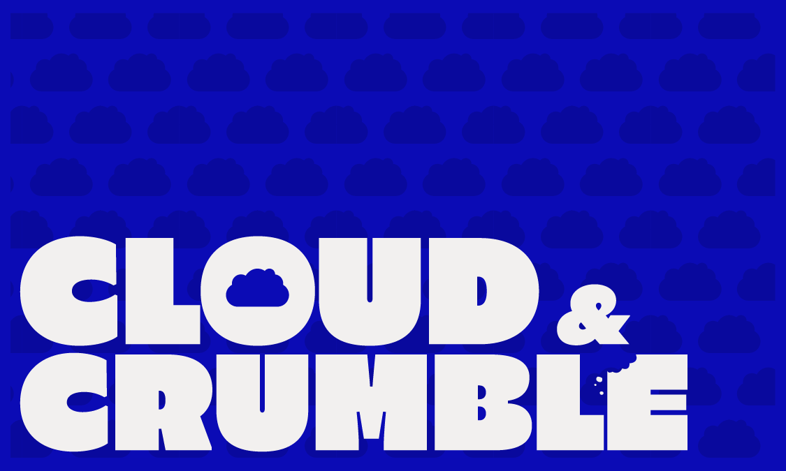
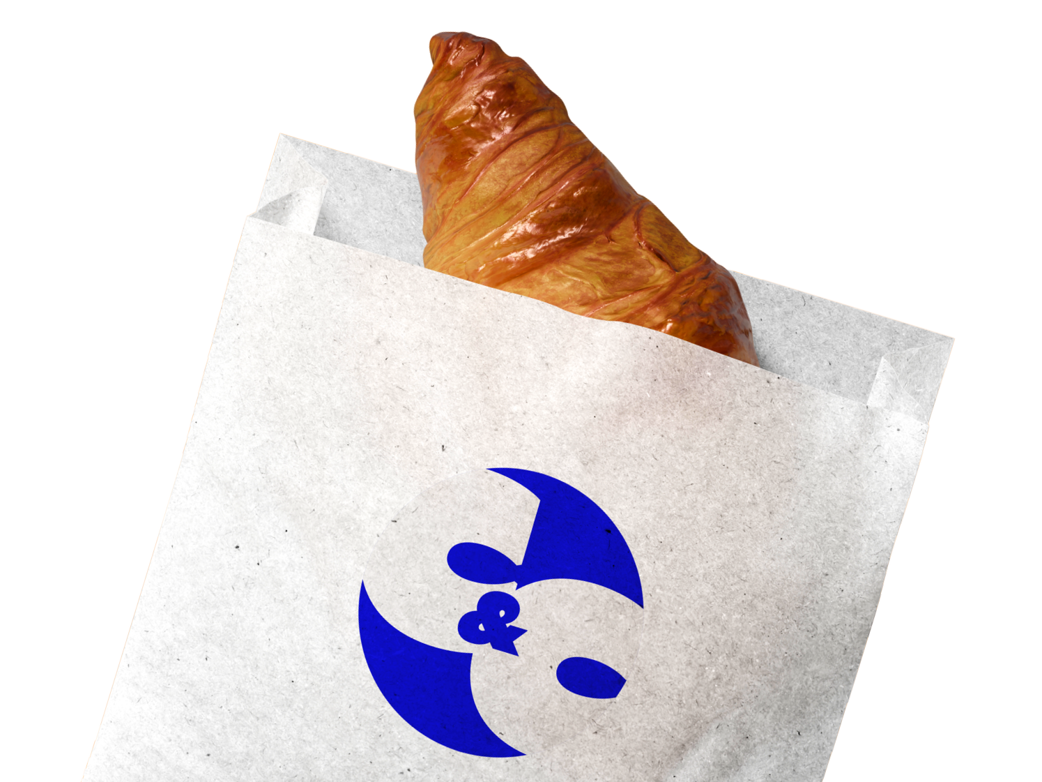
Cloud & Crumble - Coffee shop branding Cloud & Crumble is a branding project where I explored my personal graphic style and visual aesthetic while developing a complete visual system for a food-related chain. The project required creating a cohesive brand identity, and I chose to design a concept for a coffee shop. Through playful graphics, typography, and branding elements, the project focuses on building a distinctive and engaging identity that could be applied across different brand touchpoints.
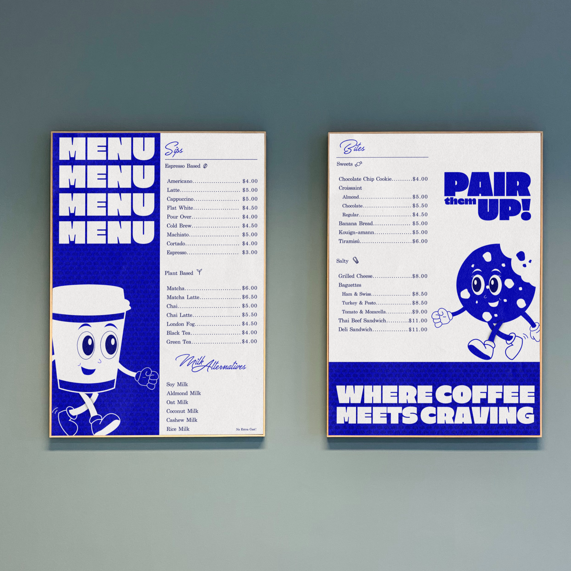
Cloud & Crumble - Coffee shop branding (Menu)
Cloud & Crumble - Coffee shop branding
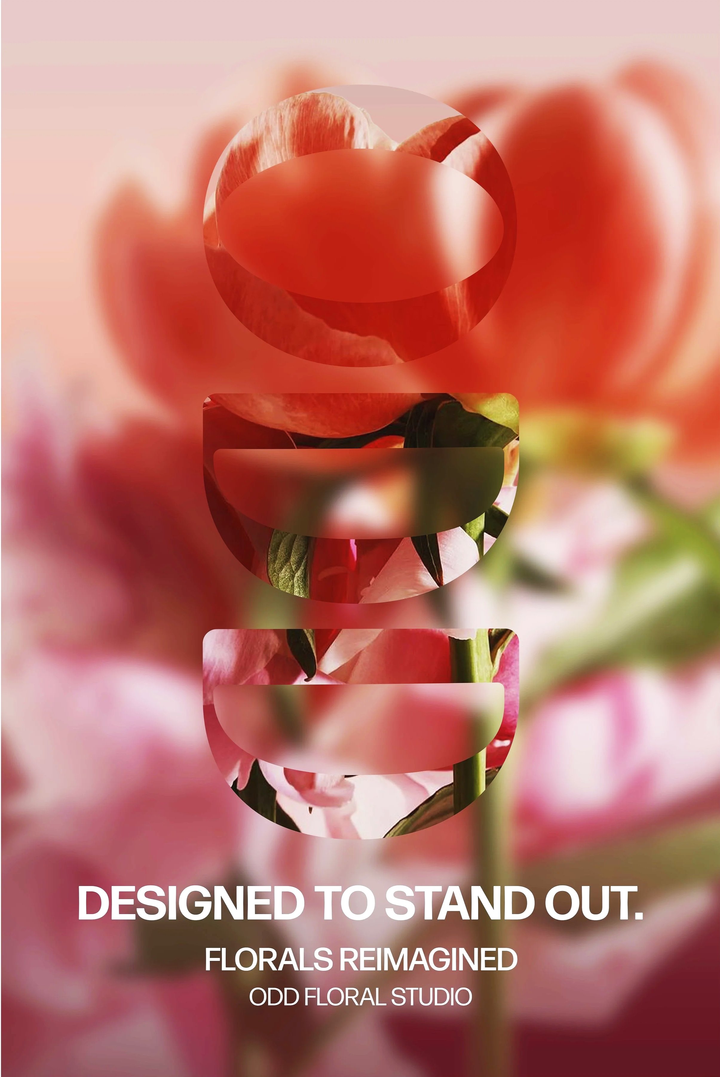
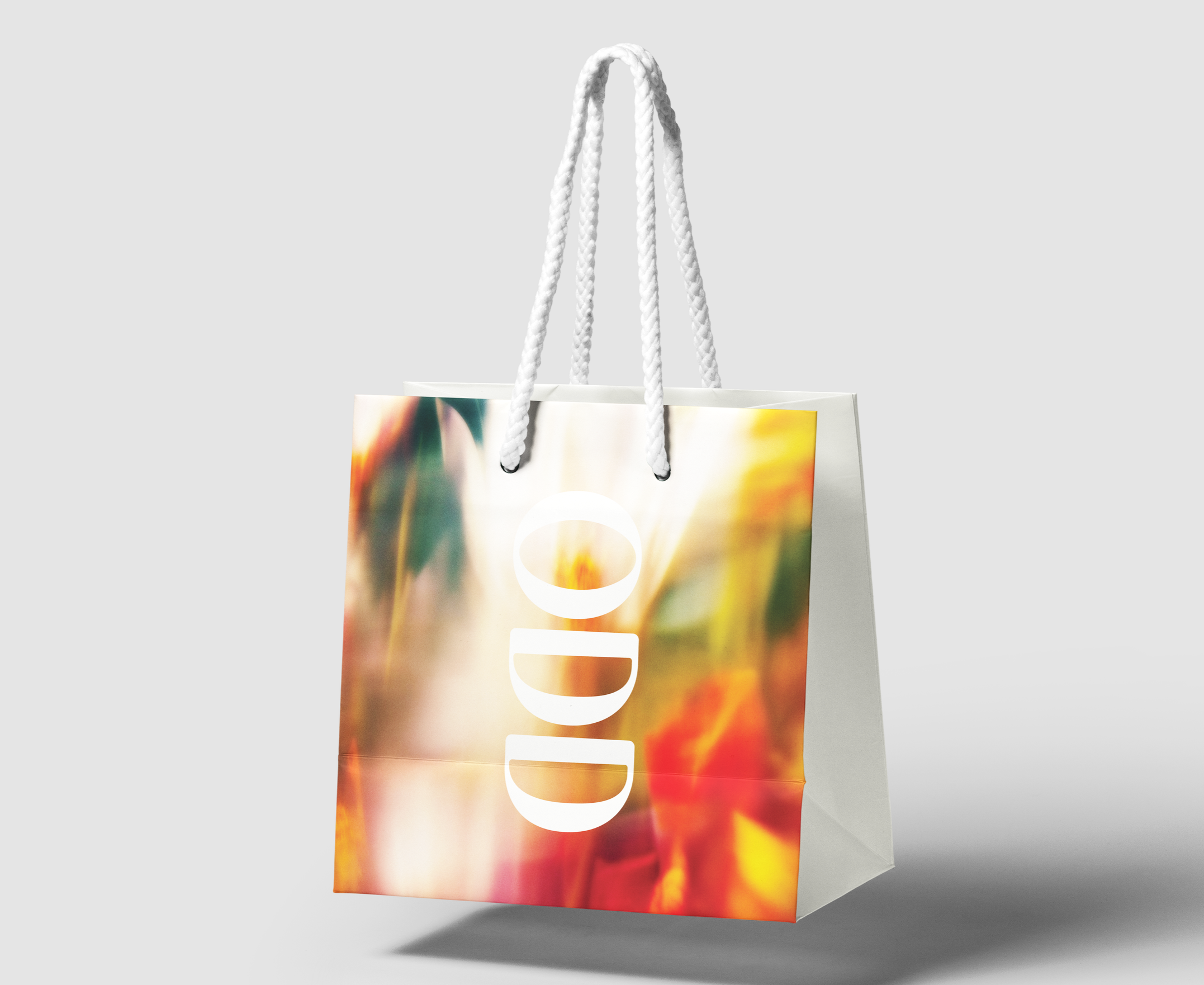
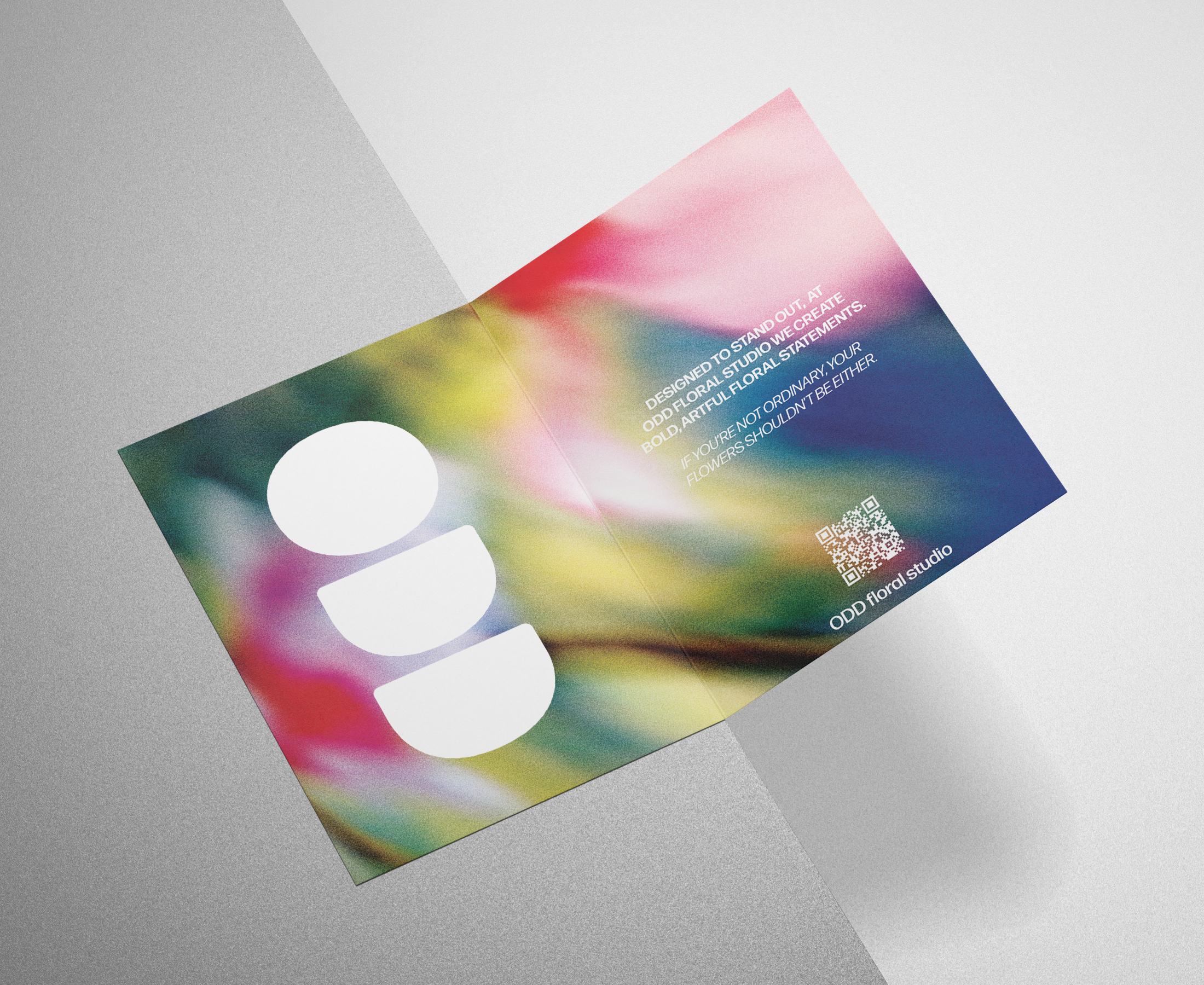
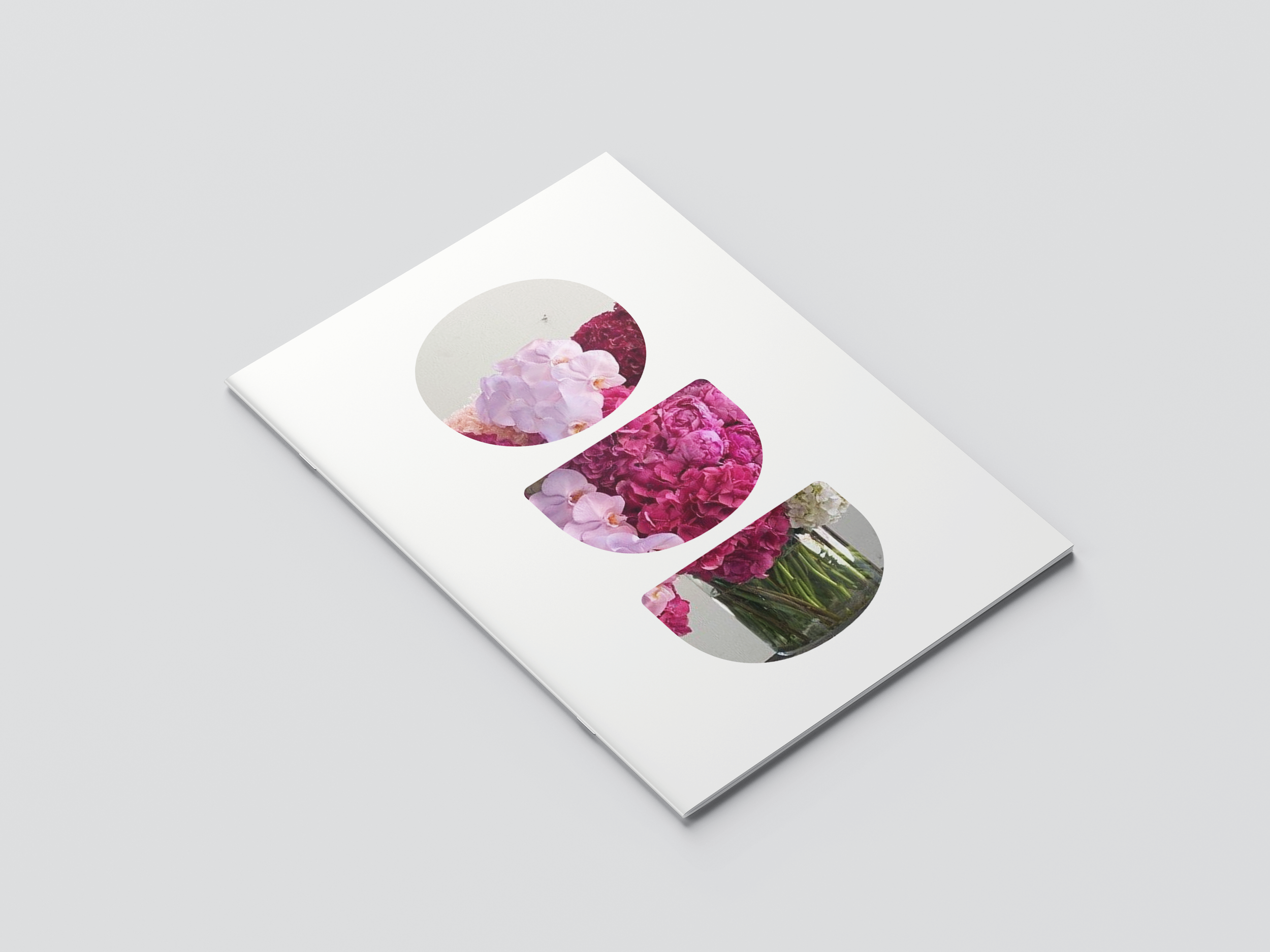
ODD Floral Studio - Branding - Exhibition Poster ODD Floral Studio is a speculative branding and service design project that reimagines the flower-buying experience through a more intentional and art-driven lens. Inspired by my experience working in a flower shop, the project explores how floral arrangements can move beyond transactional purchases and instead become meaningful, expressive objects. ODD positions floral design as sculptural and unconventional, supported by a bold visual identity and a cohesive system of branded touchpoints including packaging, stationery, and certificates of authenticity. The project integrates brand identity, graphic systems, and service design to transform gifting flowers from a routine purchase into a curated and memorable experience.
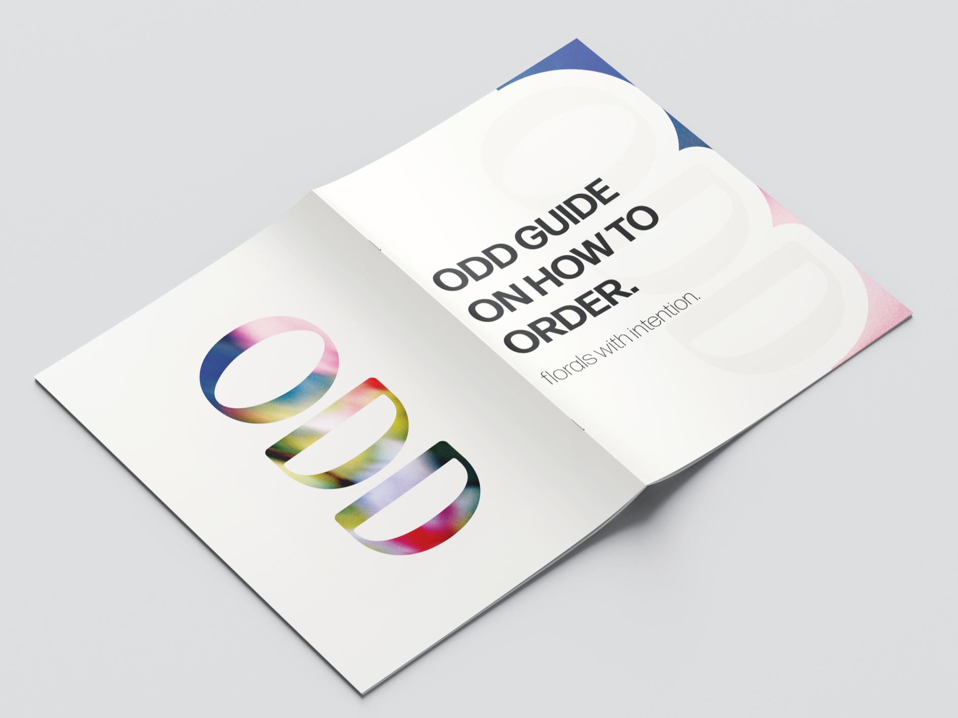
ODD Floral Studio - Branding - Guide to Order
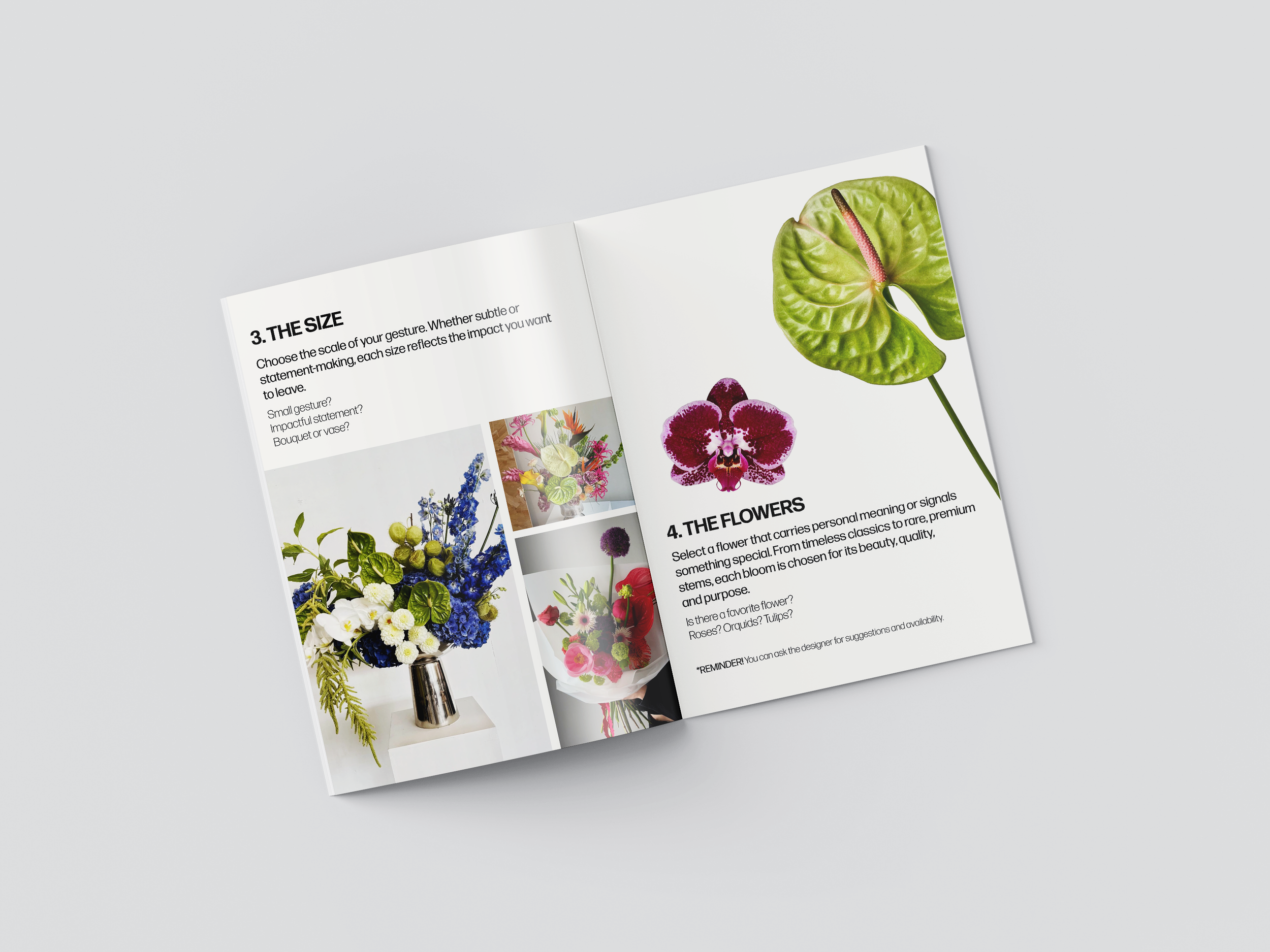
ODD Floral Studio - Branding - Guide to Order
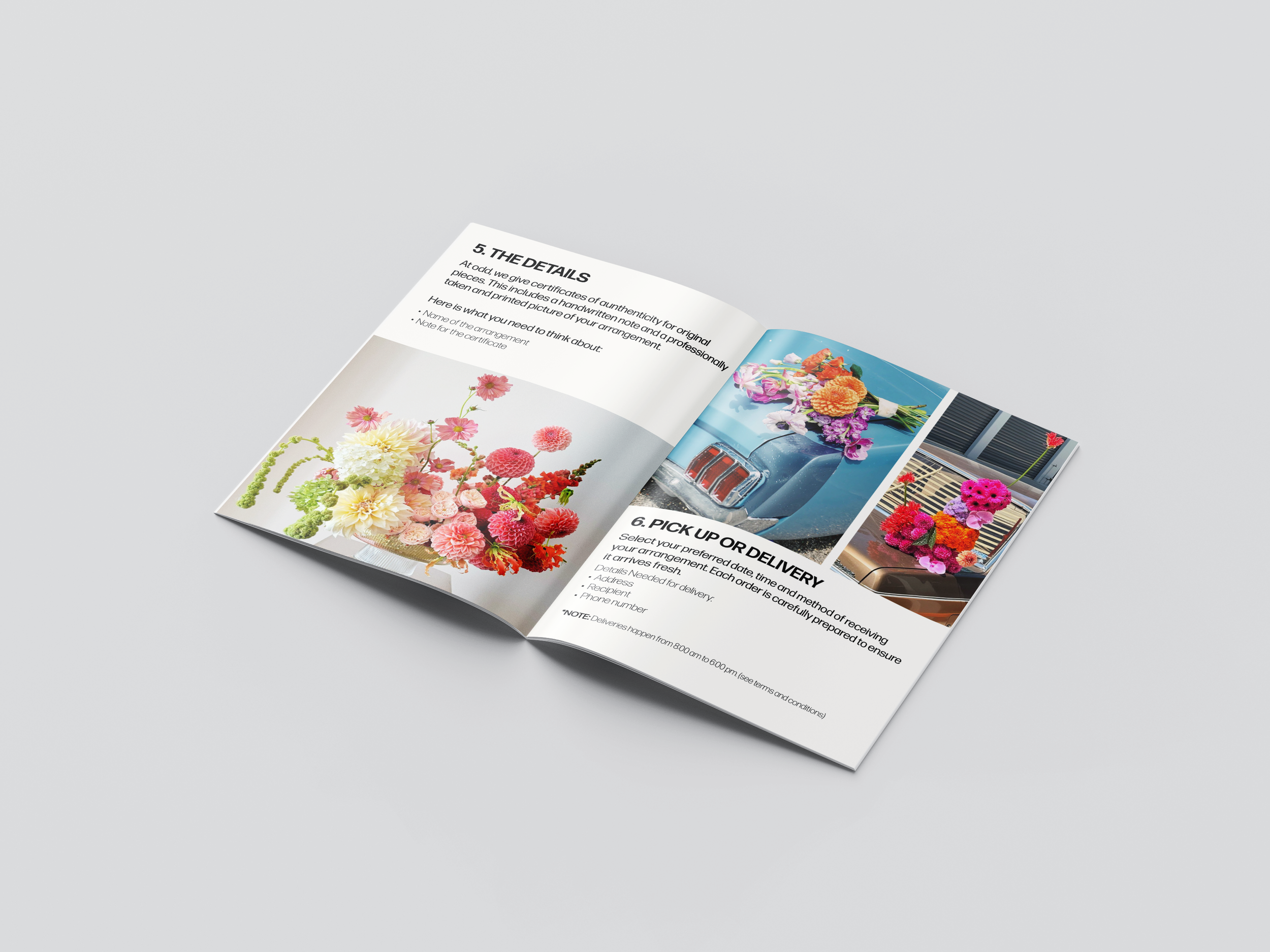
ODD Floral Studio - Branding - Guide to Order
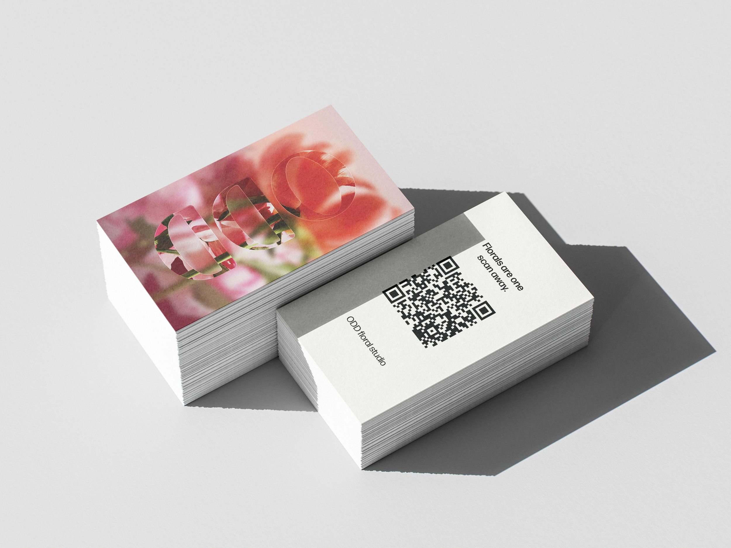
ODD Floral Studio - Branding - Business Cards
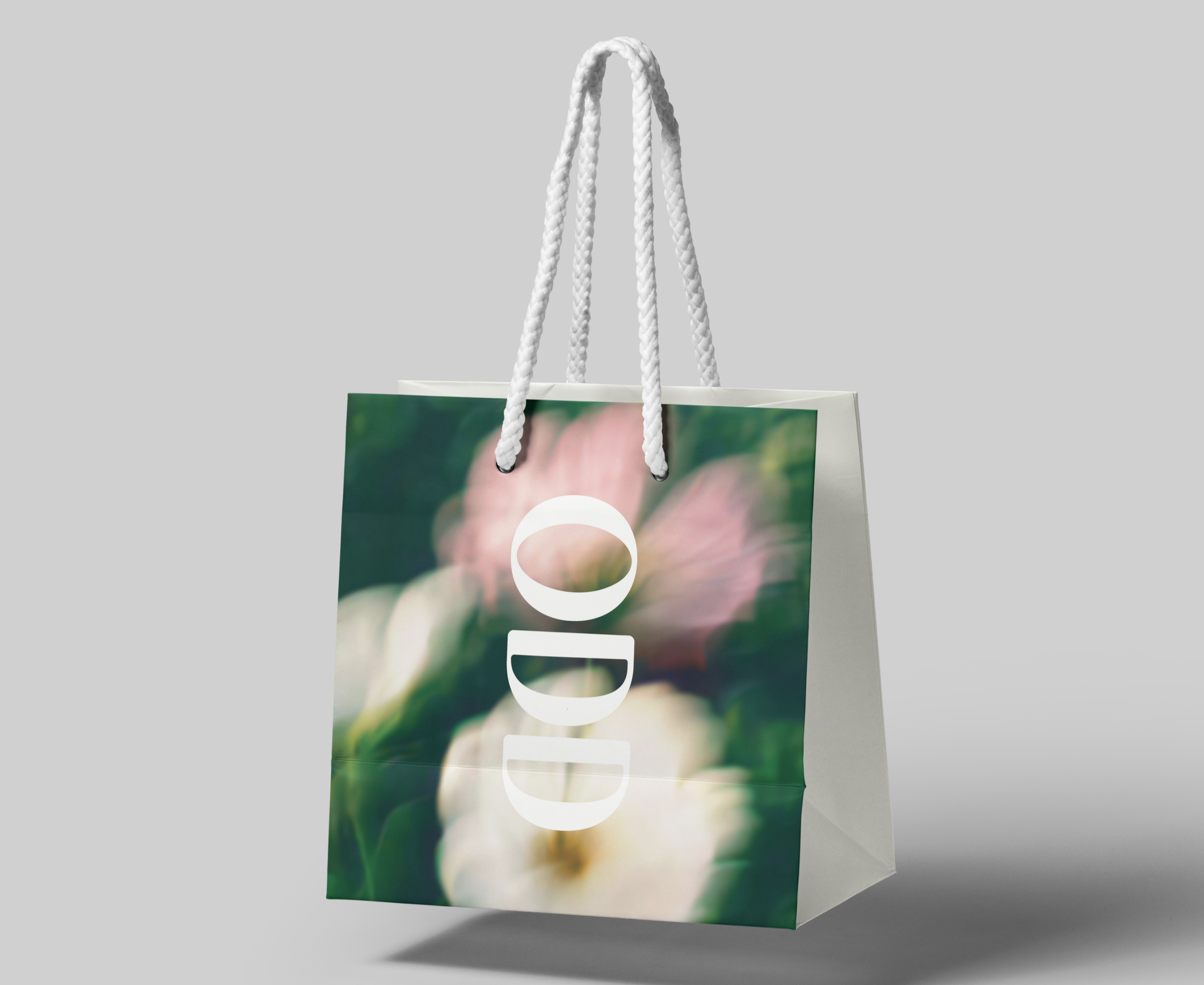
ODD Floral Studio - Branding - Bags
ODD Floral Studio - Branding - Bags
ODD Floral Studio - Branding - Certificate
ODD Floral Studio - Branding - Certificate
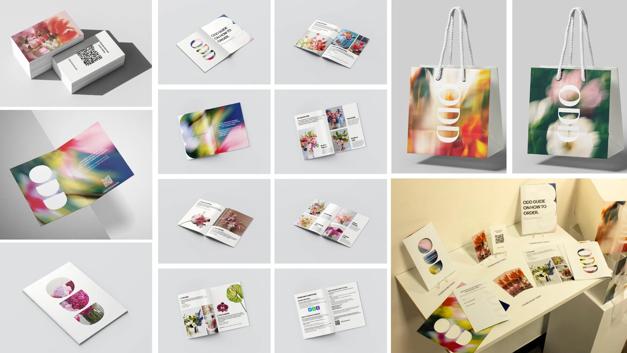
ODD Floral Studio - Branding System
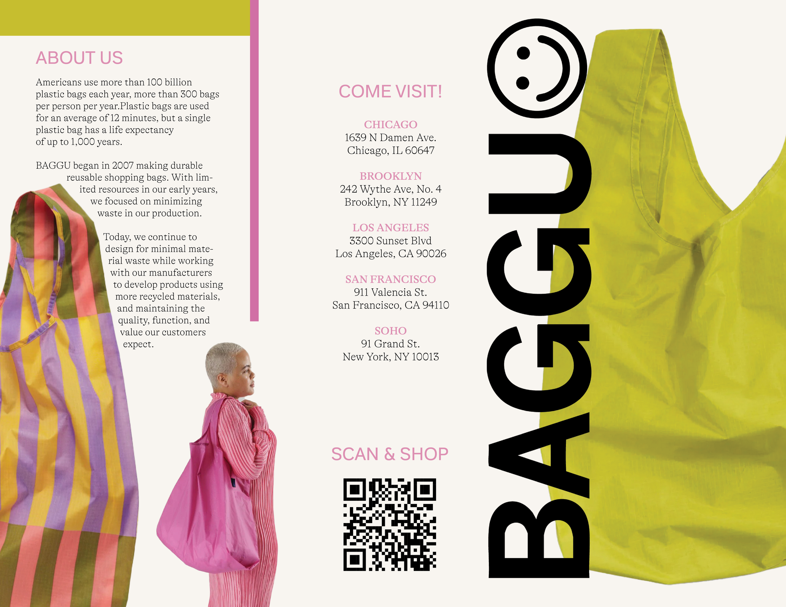
BAGGU - Informational Brochure This project is a marketing brochure designed for Baggu, centered on communicating the brand’s commitment to sustainability and thoughtful design. The concept highlights Baggu’s use of recycled and ecological materials while visually reinforcing its playful yet minimal identity. Through strategic layout, typography, color, and imagery, the brochure emphasizes the brand’s core values—functionality, durability, and environmental responsibility—creating a piece that feels both informative and aligned with Baggu’s bold, modern aesthetic.
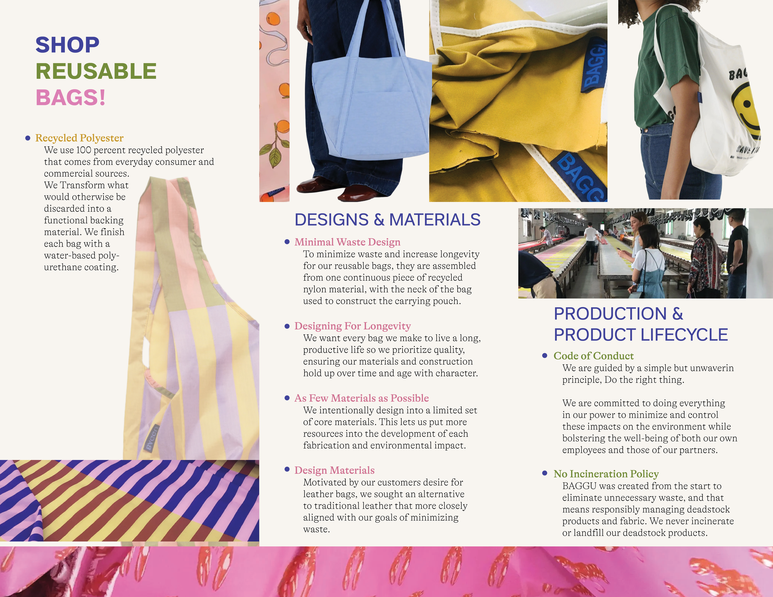
BAGGU - Informational Brochure
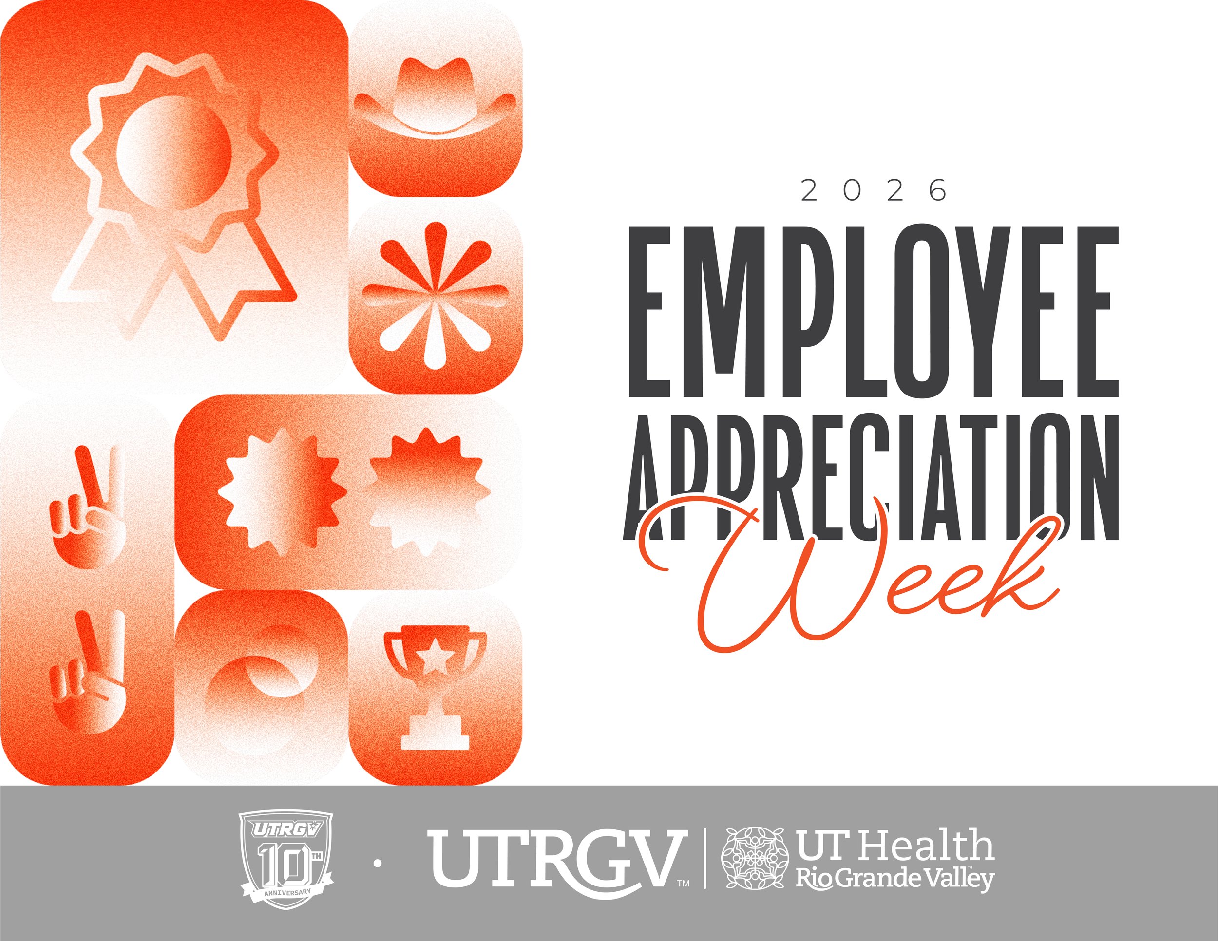
UTRGV Marketing & Communications - Branding - Employee Appreciation Week
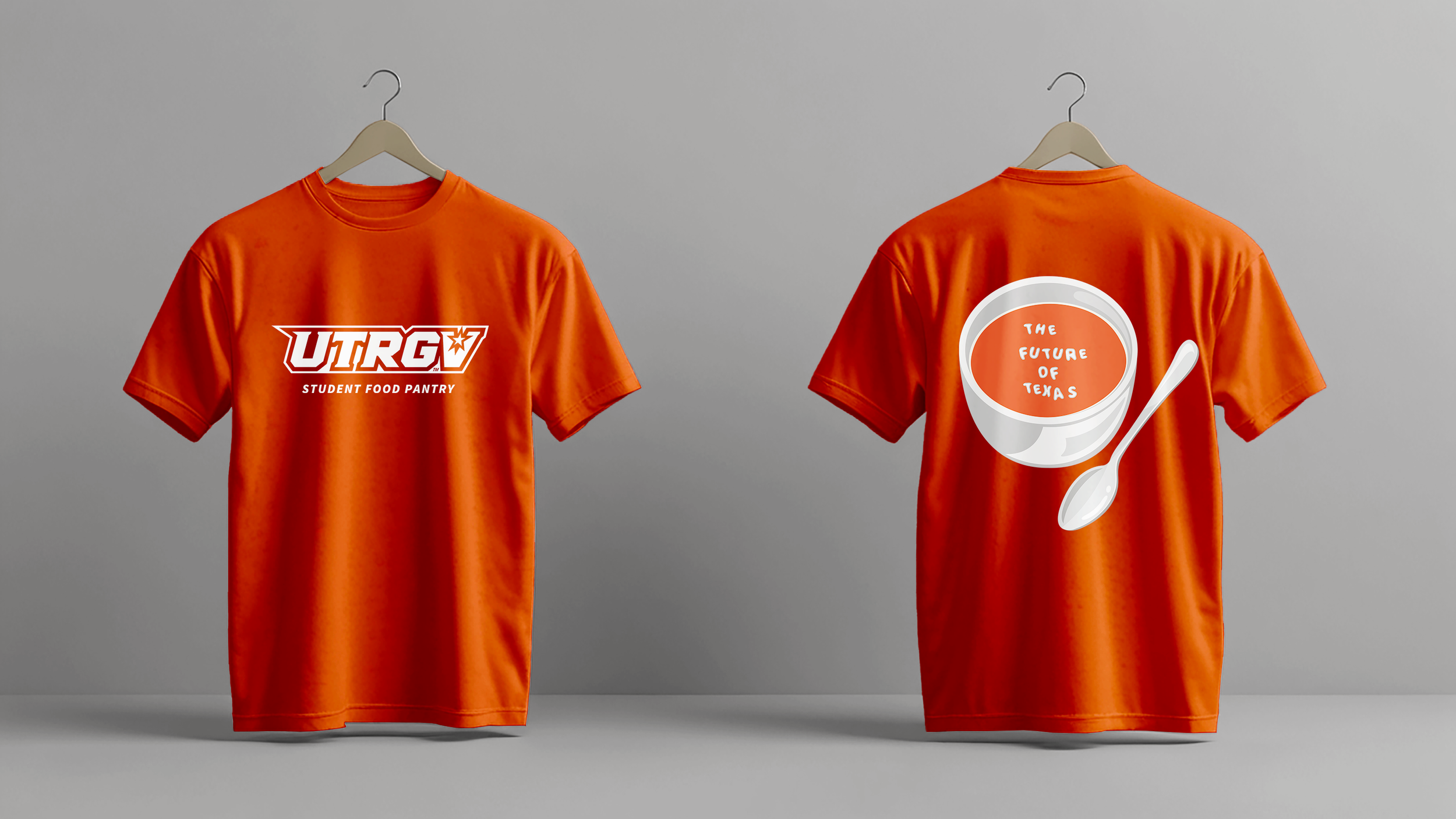
UTRGV Marketing & Communications - Food Pantry T-Shirt The Student Food Pantry T-Shirt project focused on creating merchandise that students would genuinely want to wear while promoting awareness of the campus food pantry. The design balances the client’s request with the university’s branding guidelines, carefully considering color usage, messaging, and call-to-action requirements. The result is a design that is visually appealing, student-friendly, and aligned with the institution’s communication standards.
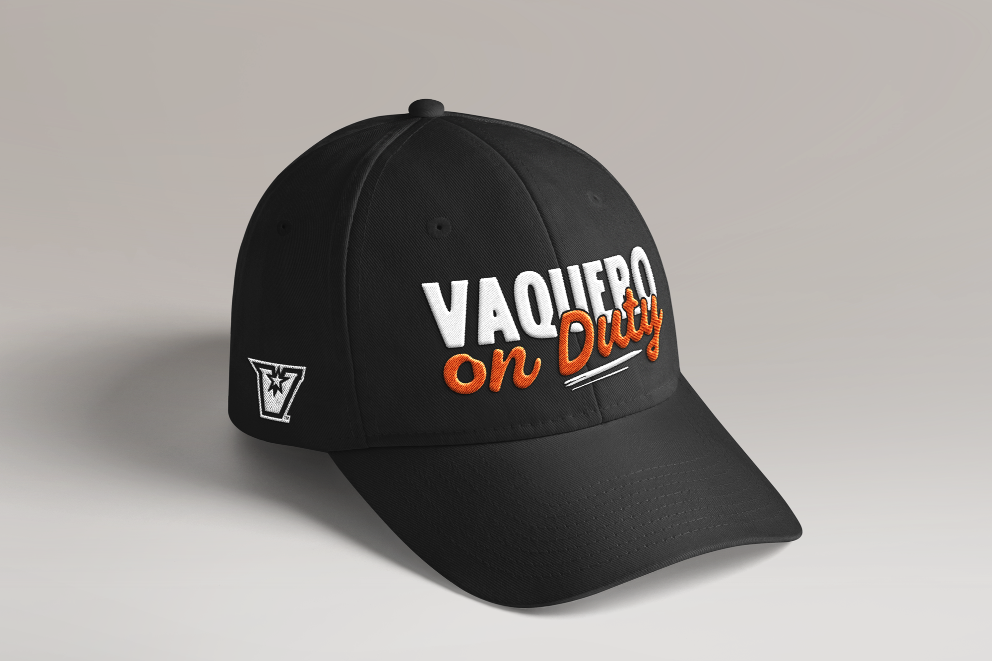
UTRGV Marketing & Communications - Employee Appreciation Week Caps Vaquero on Duty is a project developed at my graphic design job in the UMC (University Marketing and Communications) team for Employee Appreciation Week. The task was to design a cap that would be awarded to selected student employees. Instead of using the initial phrase “I Work Here,” I proposed the concept “Vaquero on Duty,” a more spirited and engaging message that better resonates with the student audience while reinforcing school pride (the vaquero) and identity.
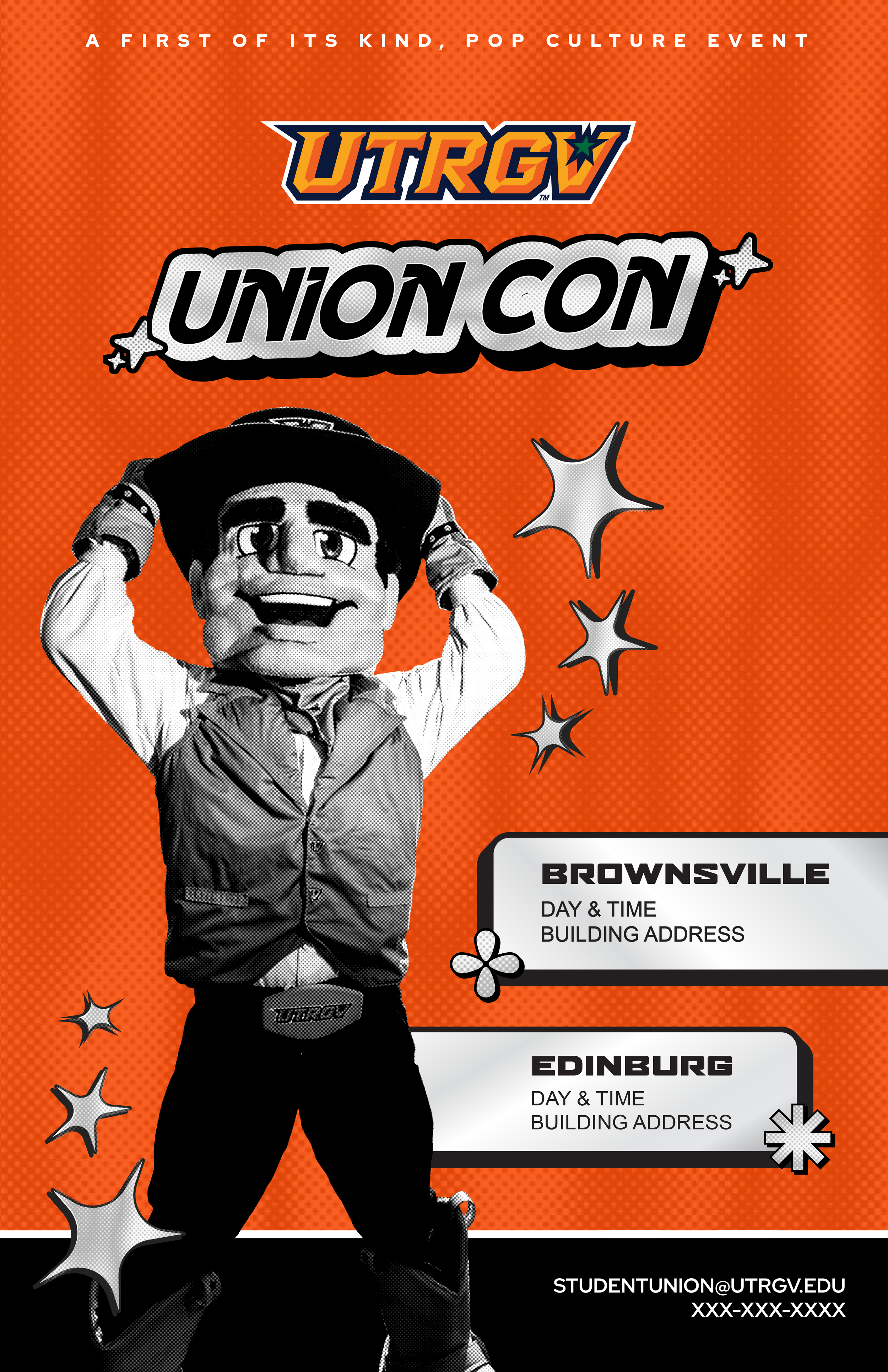
UTRGV Marketing & Communications - UnionCon Branding Union Con is a branding project for a Student Union event inspired by the energetic atmosphere of comic and fan conventions. The event brings together students who enjoy video games, books, art, makeup, design, and film. The visual identity captures the playful and immersive spirit of these communities while remaining adaptable for university use. The branding was developed as a flexible toolkit, allowing the Student Union’s graphic designers to easily create additional collateral and promotional materials while maintaining a cohesive look.
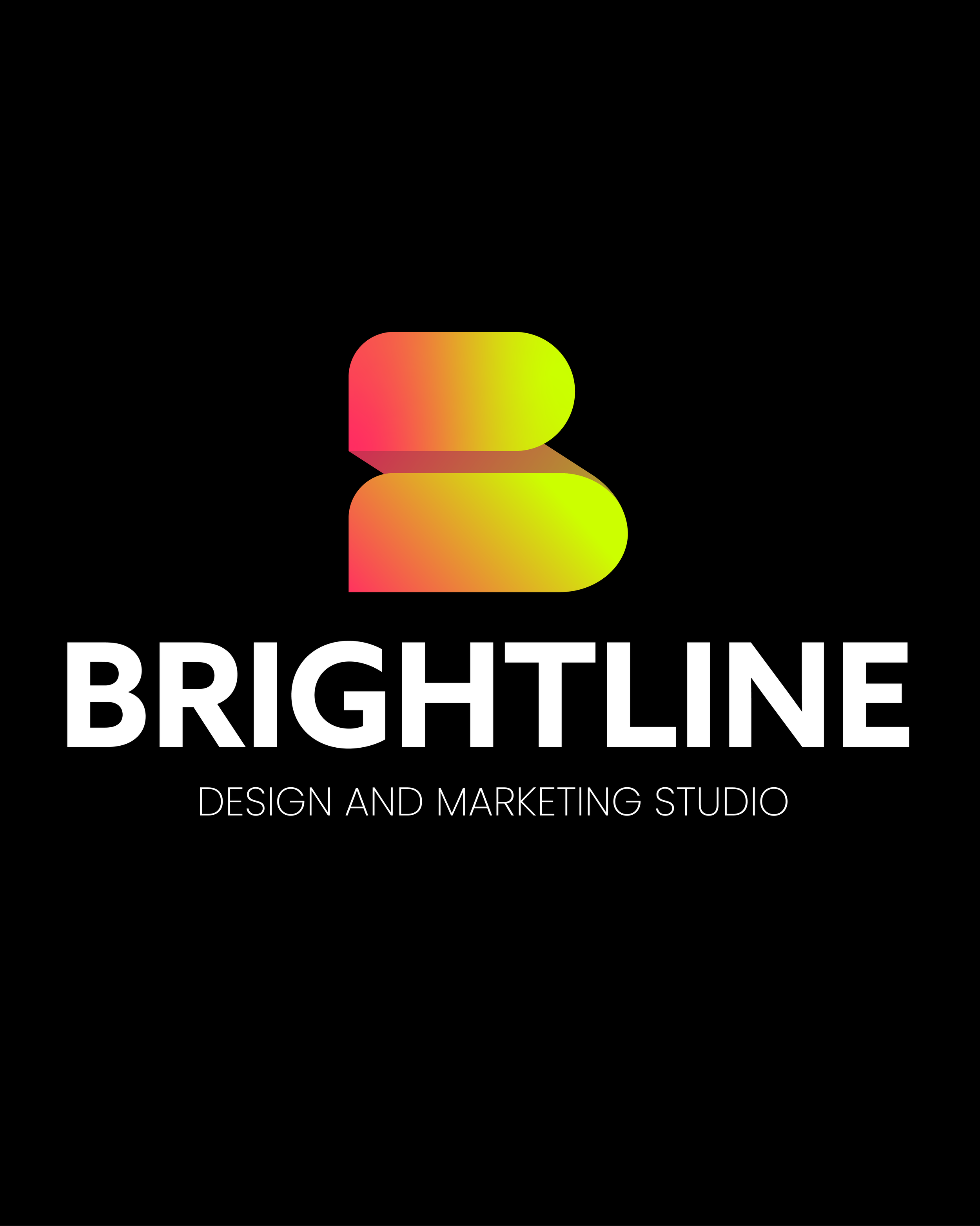
BRIGHTLINE - Branding & Brandbook (Addy Award Winner - Gold) This project focuses on developing a cohesive brand identity for BRIGHTLINE Design & Marketing Studio, a conceptual creative studio specializing in strategic design and marketing solutions. The goal was to craft a visual system that reflects clarity, precision, and forward-thinking strategy. Alongside the identity, we created a comprehensive brand book outlining the proper use of the logo, proportions, clear space, color specifications, typography, and application guidelines to ensure consistency across all platforms. The final outcome presents BRIGHTLINE as a studio that bridges creativity and strategy, emphasizing clear direction, strong visual impact, and purposeful design.
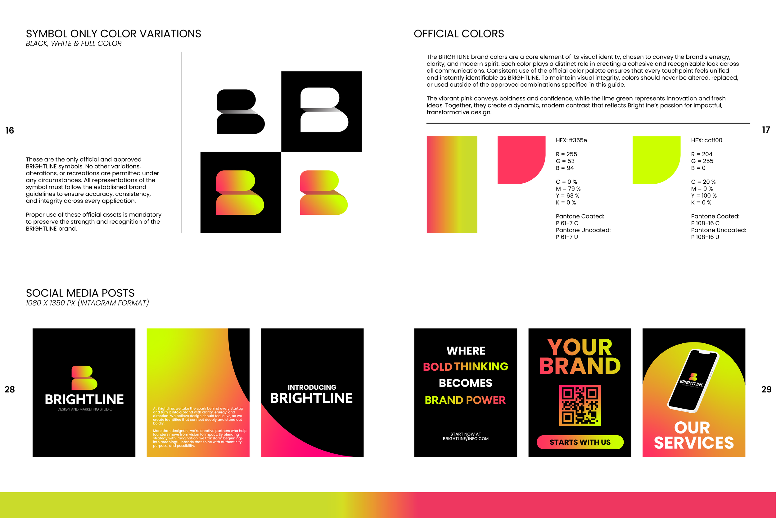
BRIGHTLINE - Branding & Brandbook (Addy Award Winner - Gold)
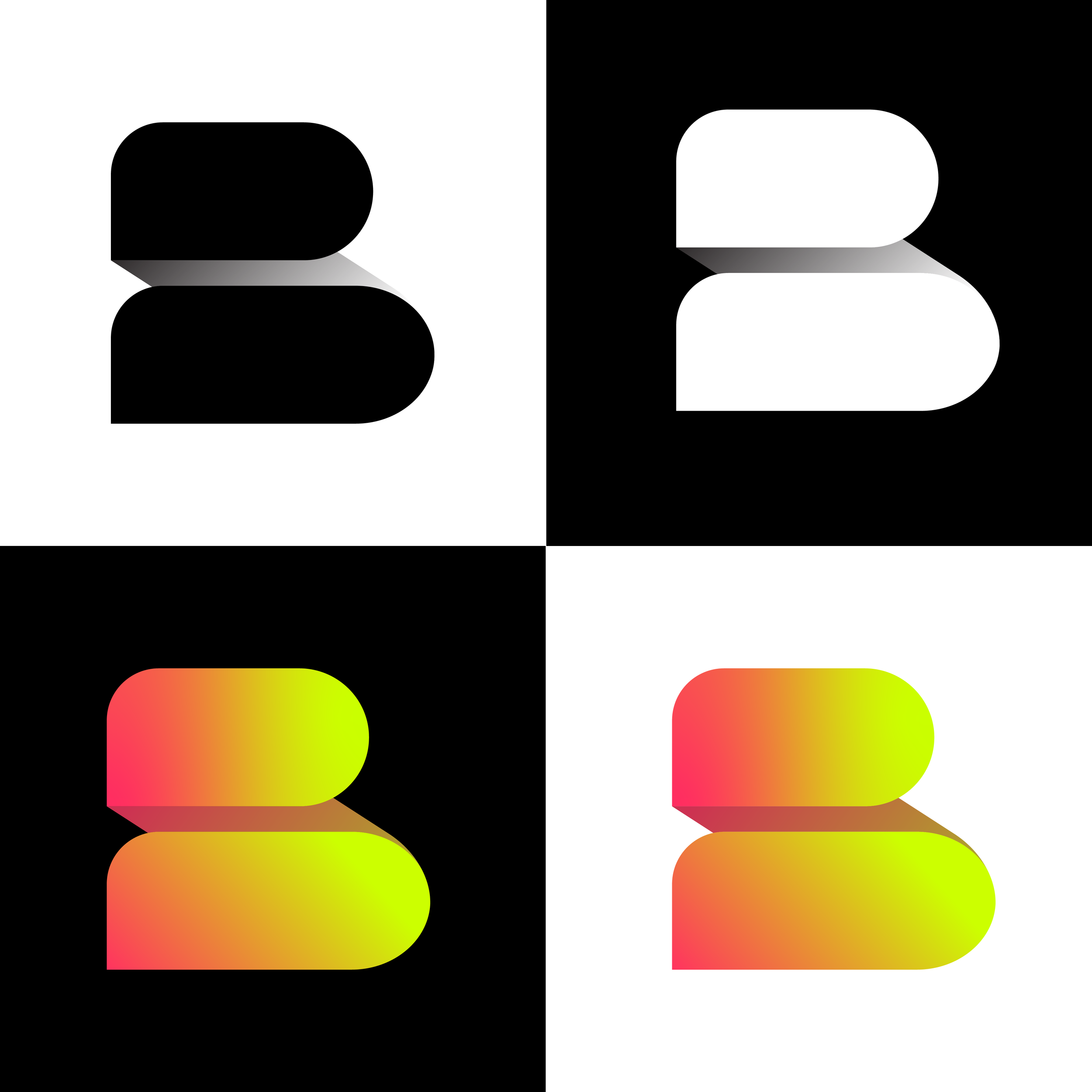
BRIGHTLINE - Branding & Brandbook (Addy Award Winner - Gold)

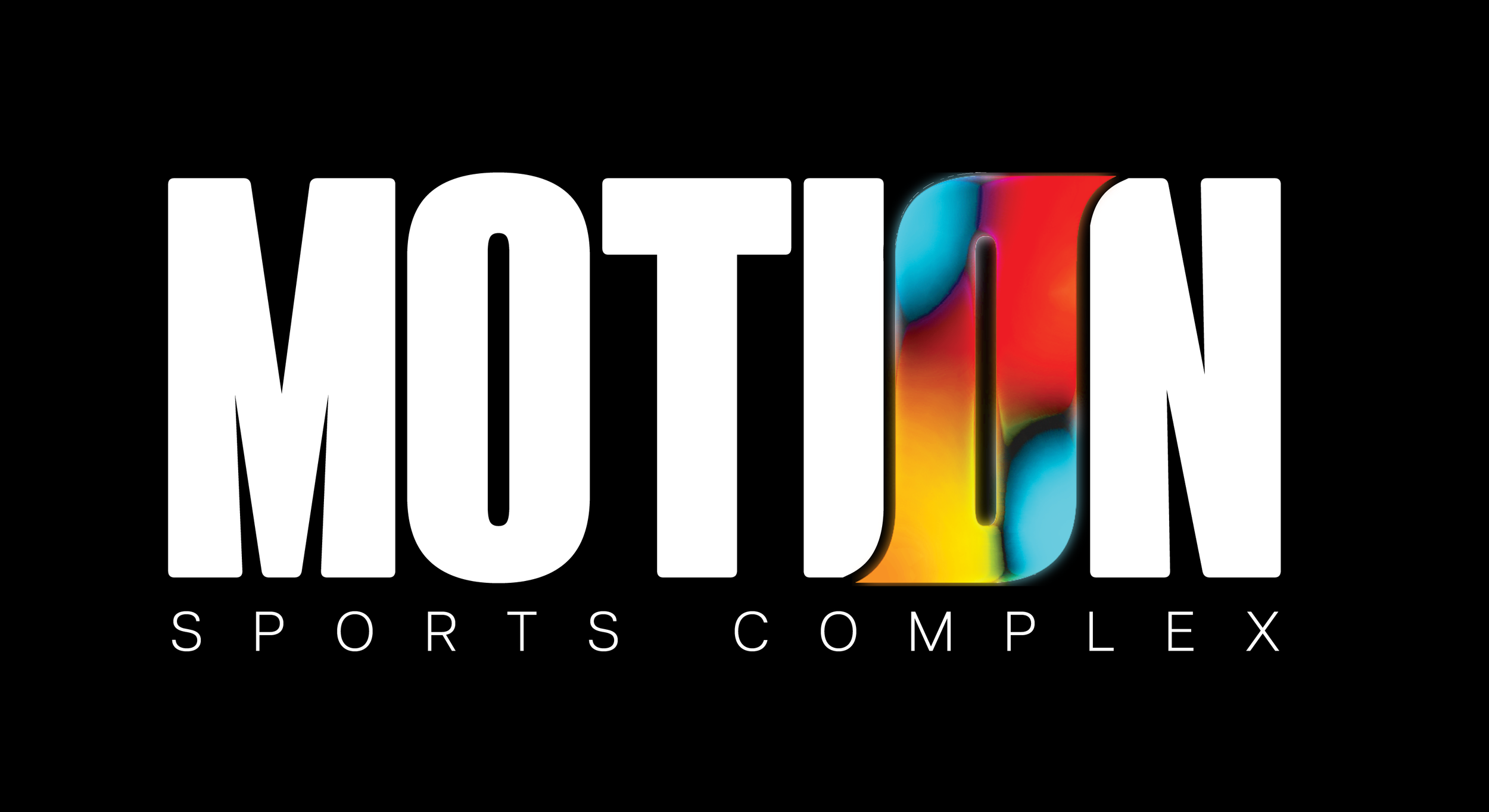
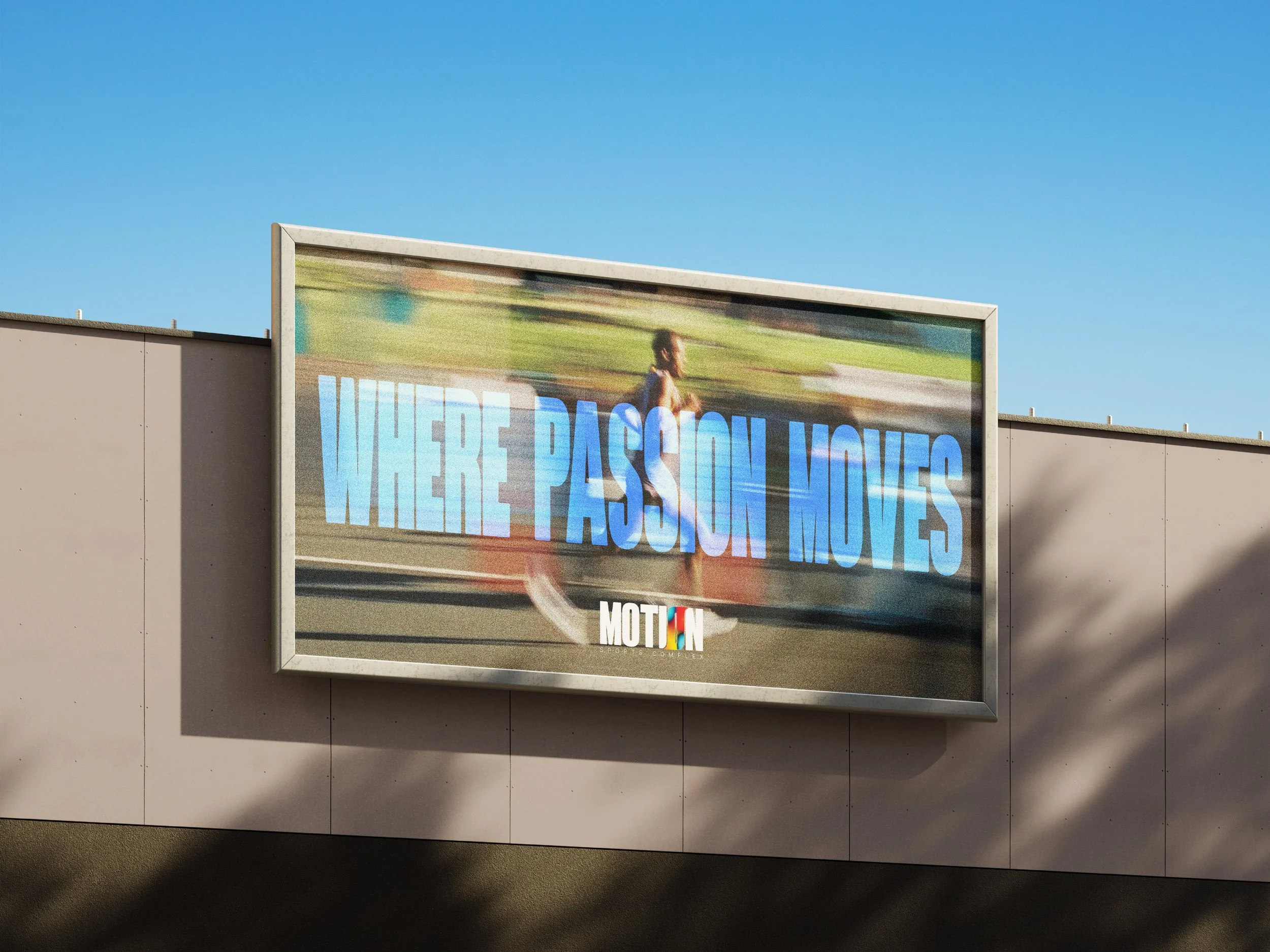
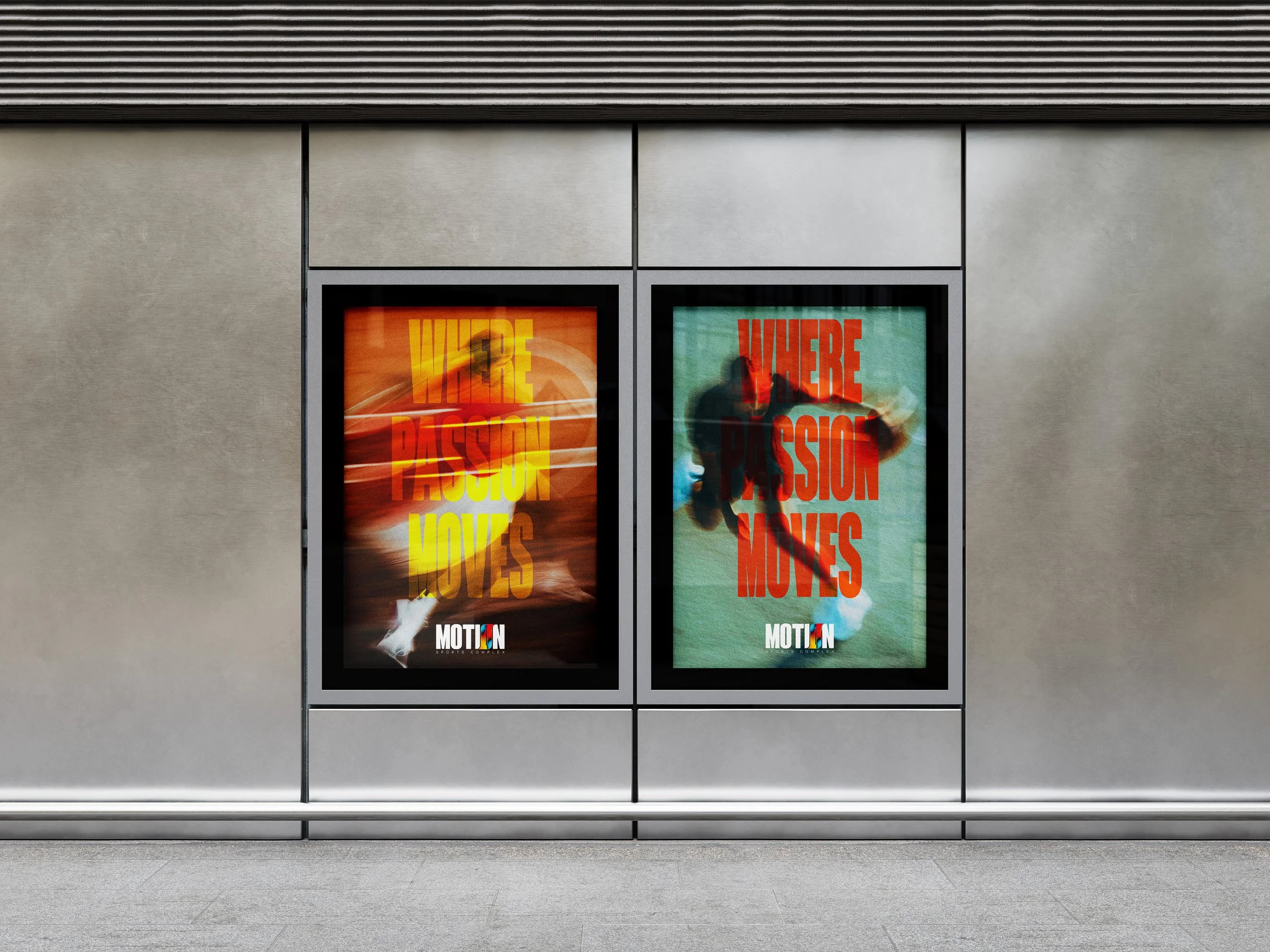
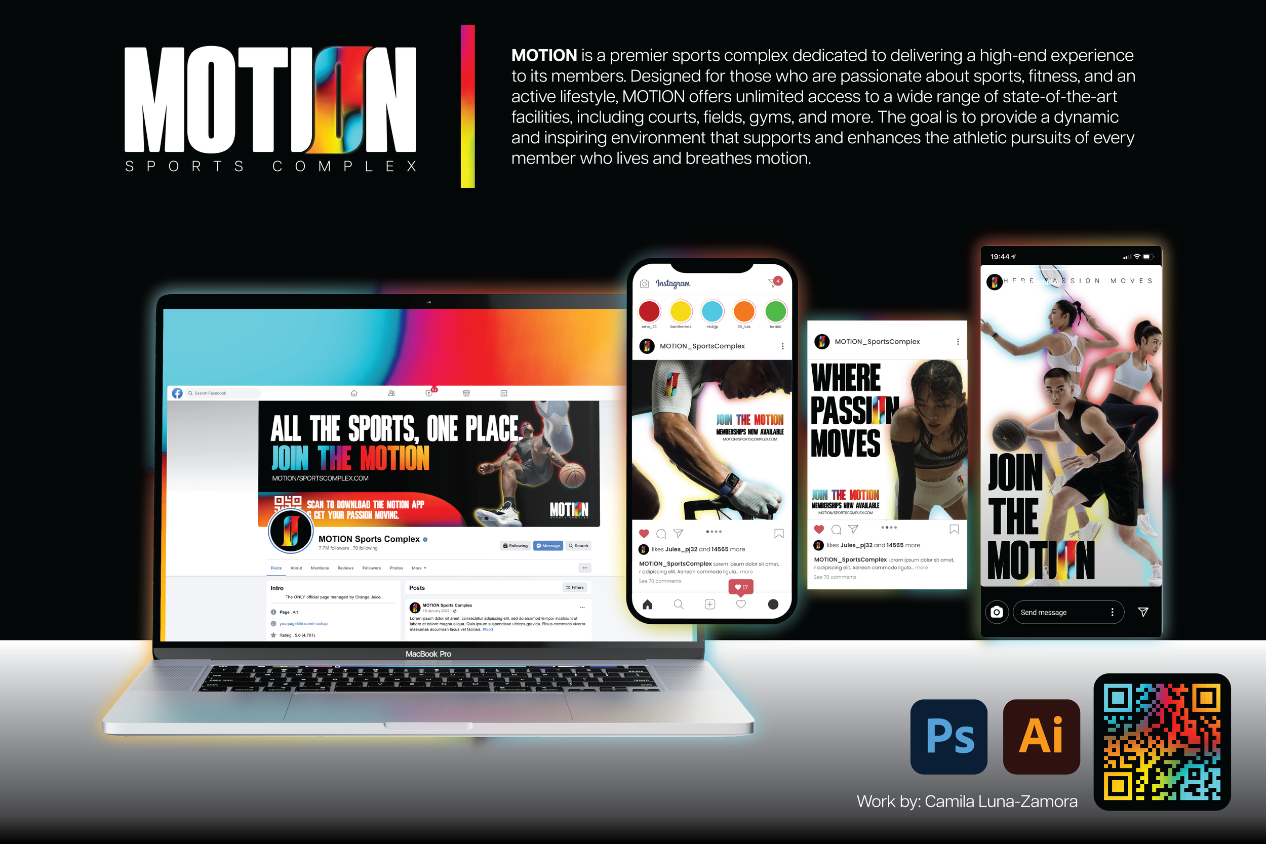
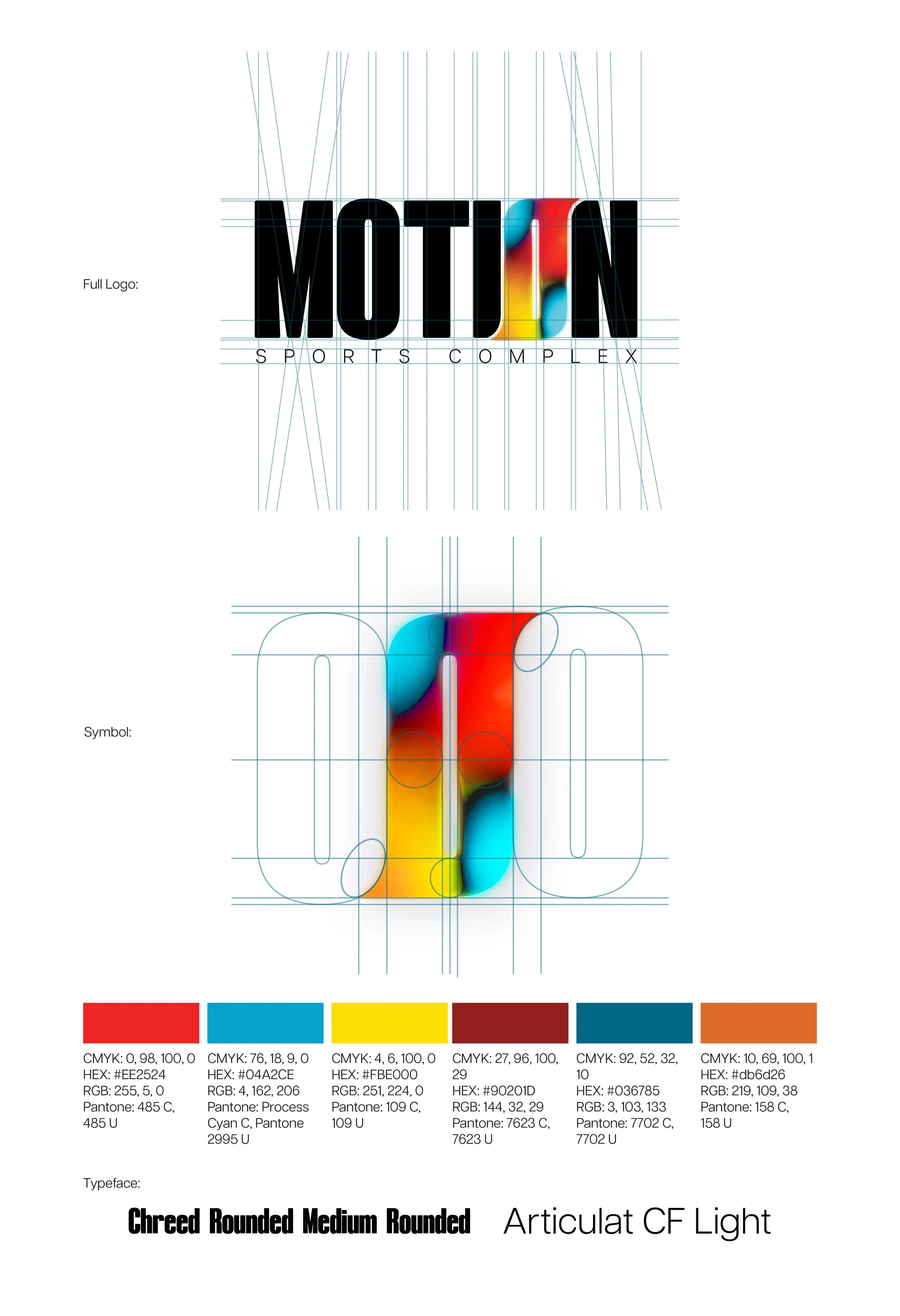
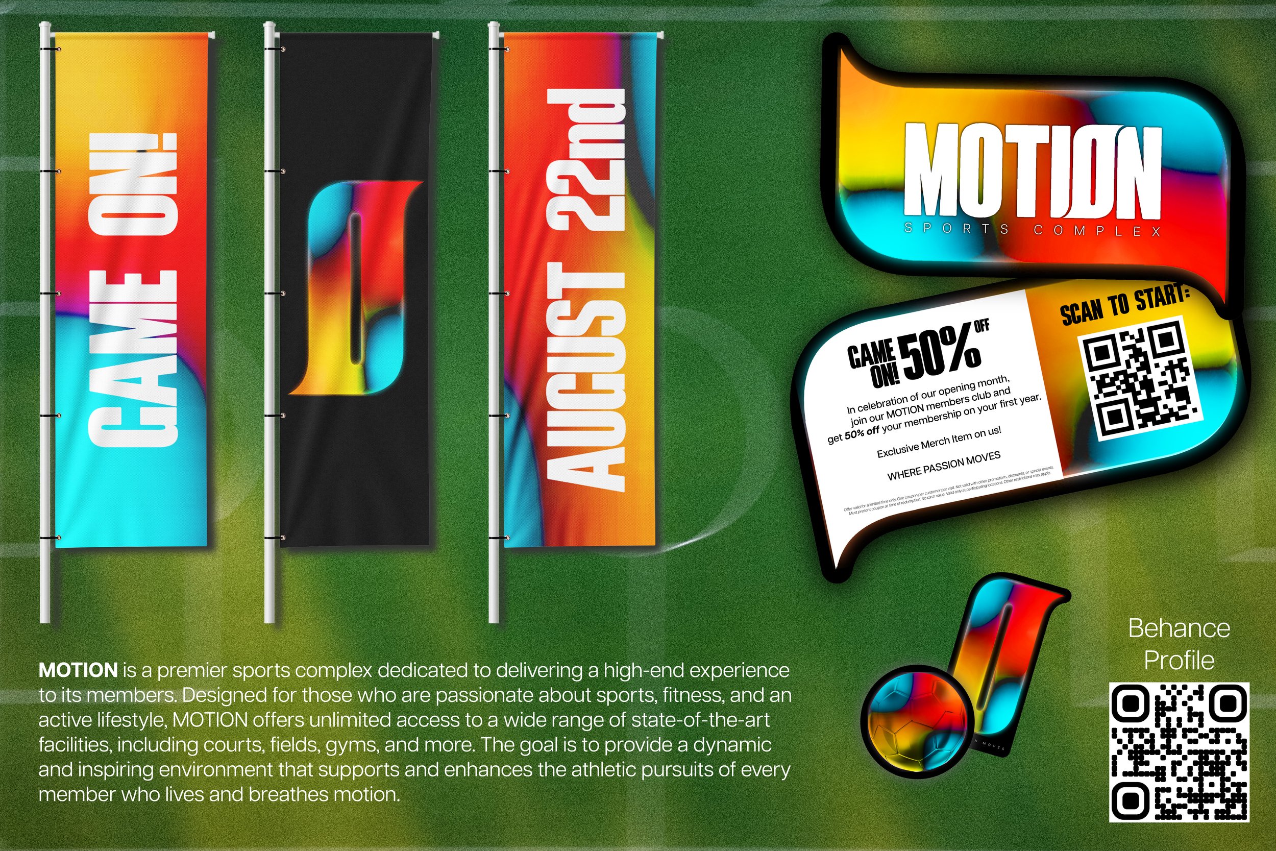
MOTION - Branding for a Sports Complex MOTION Sports Complex is a branding project focused on creating a dynamic visual identity for a modern athletic facility. The project involved designing a logo and a series of digital assets that reflect energy, movement, and community. Through bold typography, strong visual elements, and cohesive design applications, the branding created communicates an active and engaging environment for athletes and visitors.
MOTION - Branding for a Sports Complex
MOTION - Branding for a Sports Complex
MOTION - Branding for a Sports Complex
MOTION - Branding for a Sports Complex
MOTION - Branding for a Sports Complex
MOTION - Branding for a Sports Complex
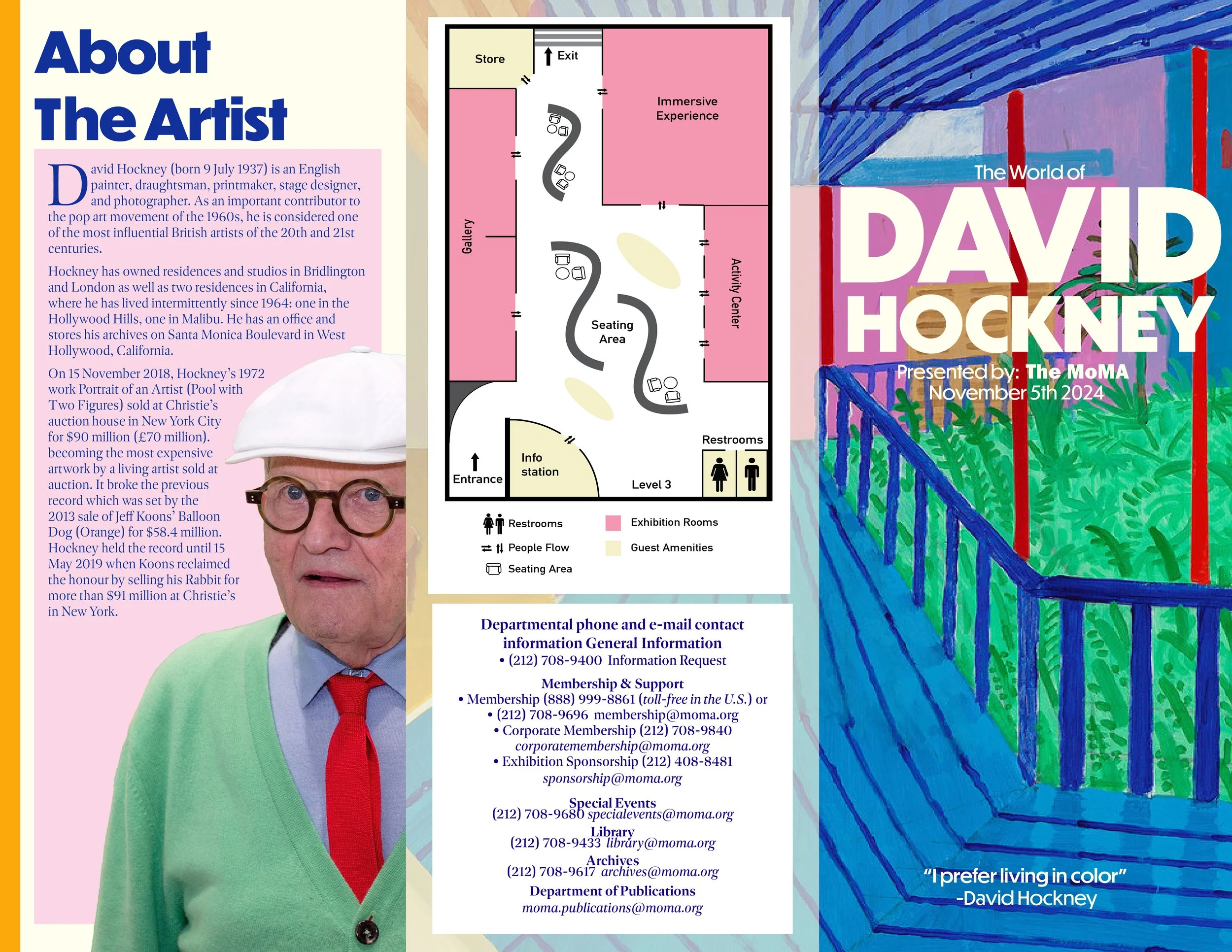
David Hockney - Informational Brochure for Museum Exhibition This project is a conceptual exhibition brochure for a fictional David Hockney show at Museum of Modern Art. The goal was to use core graphic design principles to clearly and effectively communicate the spirit & scope of the exhibition. Through intentional use of hierarchy, grid systems, margins, pull quotes, and image placement, the brochure guides readers through Hockney’s vibrant world while reflecting the bold color, spatial exploration, and visual rhythm present in his work. The result balances clarity and expression, functioning both as an informational guide and as an extension of the exhibition’s visual identity.
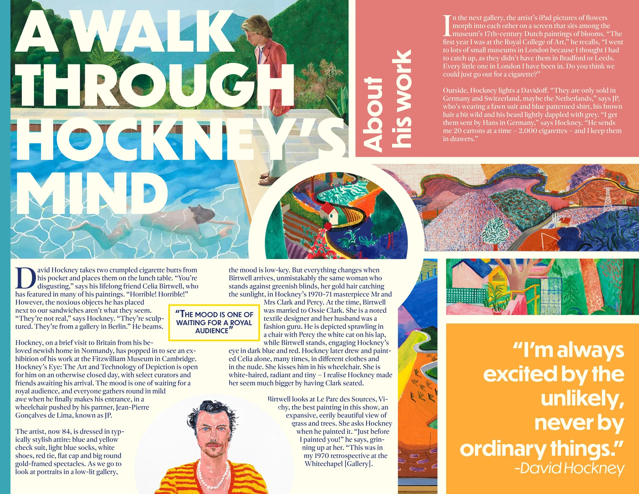
David Hockney - Informational Brochure for Museum Exhibition
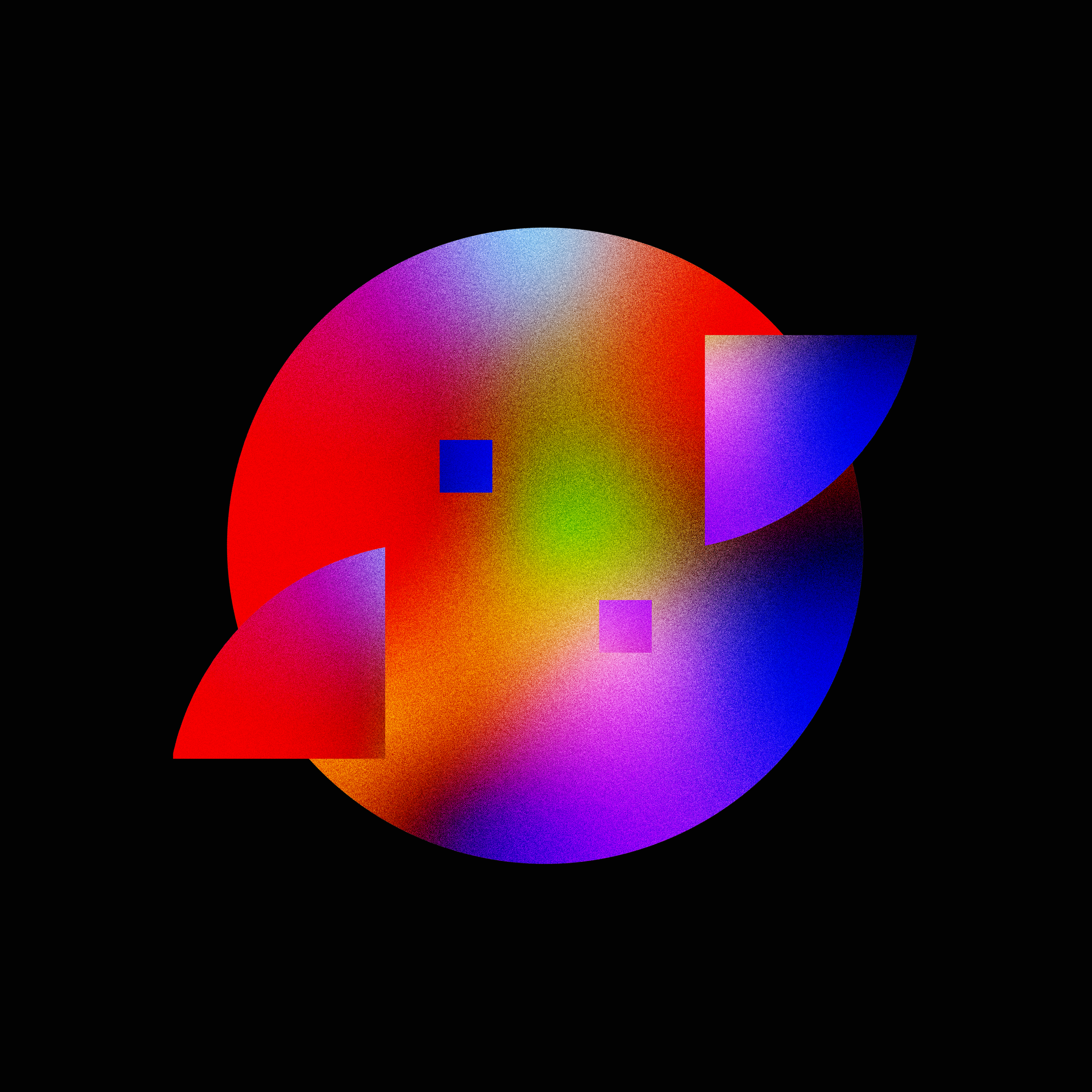
The Grid - Branding for UTRGV Spring 2026 Capstone Branding The Grid is the official capstone branding for the Spring 2026 graduating class. I had the privilege of designing the capstone poster, and I’m very grateful that my classmates voted for my concept through several rounds of selection. After an additional concept was introduced by the Promotion Committee, of which I am also a member, my design was ultimately chosen as the final visual direction for the capstone exhibition, establishing the overall look for the event.
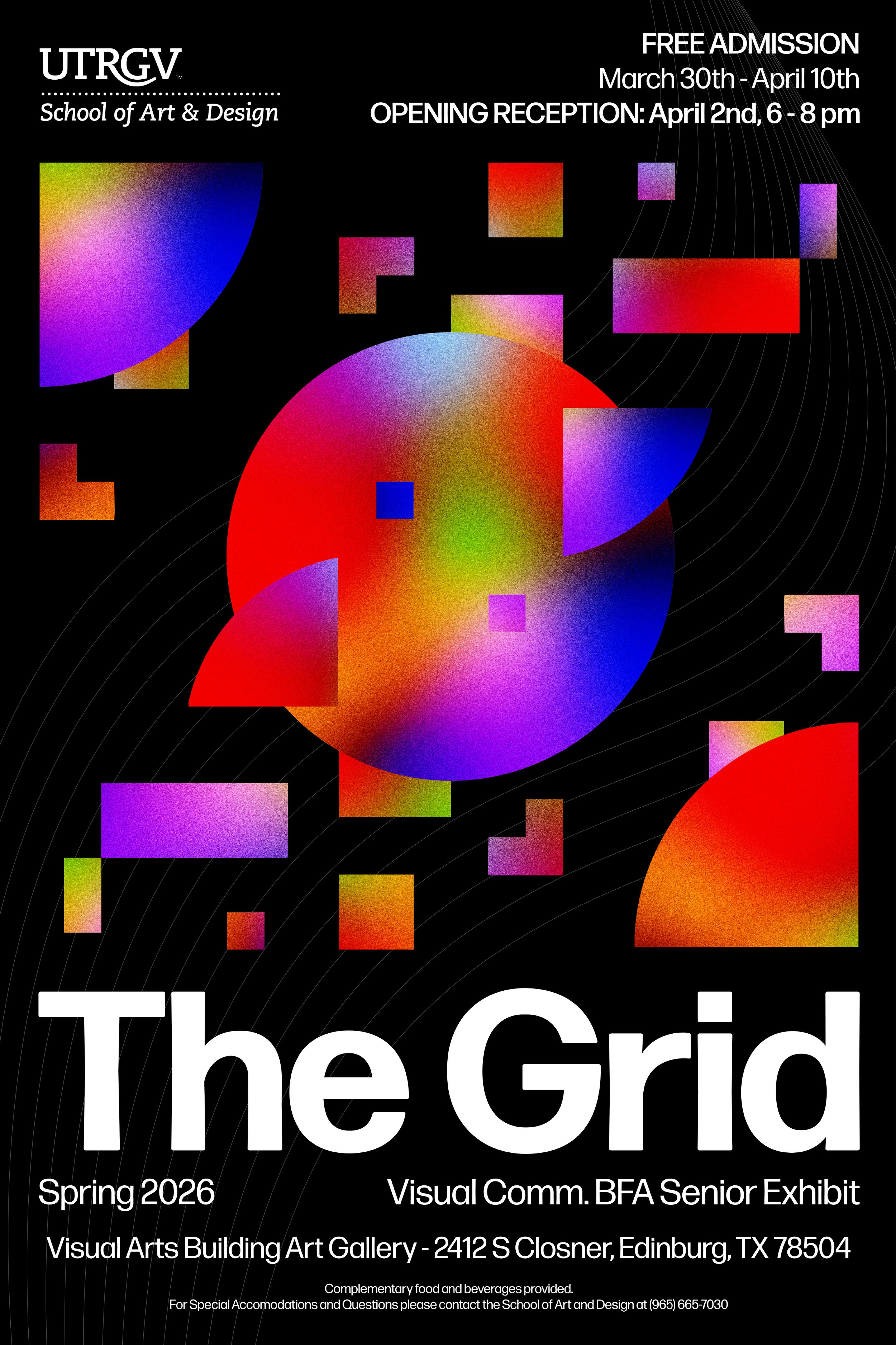
The Grid - Branding for UTRGV Spring 2026 Capstone Branding